Jesus Icon

A little intimidating. Jesus.

Wherever gold will be played, an underlayer of bole is painted on in about 10 layers after which it is sanded as carefully and smoothly as possible. Gold will show every little flaw that lies beneath it so we start with 600 grit and work our way down to the finest 1200 grit.

A thin piece of tape is placed around the outer edge to form a frame and then I am ready to lay down the gold.

You can see in this closeup the etched in lines that will guide me when I begin painting Jesus. I used an etching pen that I also use for scrimshaw etching.

The gold is glued on with a mix of rabbit skin glue and alcohol. The gold is so incredibly intimidating; it will float into the air with the slightest breezed, it will curl up and become useless with the tiniest smidge of water. The gold leaf is cajoled onto a gilding pad and a sharp knife cut the size piece needed. The knife needs to be sharp enough to cut the gold cleanly but not so sharp that is cuts the pad.

The prayer is written beneath the painting; you may or may not choose to share it. Once the clothing is painted on, the prayer will be forever hidden.

I’ve covered the gold with parchment to protect it while I paint.

Makoto Fujimura at Pepperdine

I’ve been following Makoto Fujimura’s art for a couple decades so when a rabbit trail led straight to the gallery where my son-in-law is going to law school, I realized I could visit my newest grandchild and see an artist’s work I revere.

Photos don’t do the original work justice; the multiple layers hide and appear beneath the next layer making what might appear to be a plain orange-red canvas into a complex dancing fire.

Spring has sprung

We worked on not mixing the colors on the palette but rather to simply pick up the colors on your brush and paint, letting the colors blend and stay separate for a more interesting look.

I also encouraged using a limited palette. So instead of putting a myriad of greens on the palette, use a single green and yellow and mix to get various shades.

And as always, use all the space your paper provides.


The youngest student and only male in the class; he has excelled this year.

Glass

My students learned the magic of miskit. Miskit masks the paper to preserve the white; an important part of watercolor painting. Also they learned the necessity of painting what you see not what your brain is telling you that the glass should look like.

Frank Lloyd Wright

Taliesen West in Phoenix, AZ and Pope-Leighey House in Alexandria, VA.

When we dropped our son off at Penn State for grad school we drove from Washington across the country right past the entrance to Falling Waters. But we didn’t stop. We were, well, not me, but some people in the car were intent on getting to the University. I’ve regretted their decision ever since…

Happily, we visited Talisen West while we were in Phoenix for Matthias’s wedding. And during the summer while visiting my mom in Maryland, my sisters and I toured the Pope-Leighy House.

I do love Frank Lloyd Wright’s insistence on his philosophy of organic architecture: the harmonious union of art and nature; it’s settling and beautiful.

Tea Towel Prints

This was a project that we planned as a Christmas present for the moms. I bought 100% cotton tea towels and the the students brought their amazing ideas for a linoleum block print. My constant warning to keep hands behind the blade worked almost flawlessly when suddenly one student said he’d cut himself. We washed his cut with soap and water, bandaged it up and he was back to carving.

I’ve learned some things over the years of printing. One huge help is to smear the printer’s ink on a wax coated or styrofoam plate and roll from there. Clean up is a breeze because I simply toss the plate. I used to use a big piece of tempered glass which looked very professional; but the clean up was tedious.

The other thing is with a large class, it works best to limit the color choices to around three or four. There’s less mayhem.

Working on the tea towel, the students’ first station was the ironing board to get their towels smooth. Then over to the printing area where they place their linoleum block on a sheet of paper when they are inking it. This keeps the table surface clean so that the white towel doesn’t inadvertently end up with ink splotches.

Then we put a piece of paper directly under the section they plan to print to keep the table or under layer of towel from absorbing the ink.

As usual, I was so pleased with the results.

Windows Into Heaven

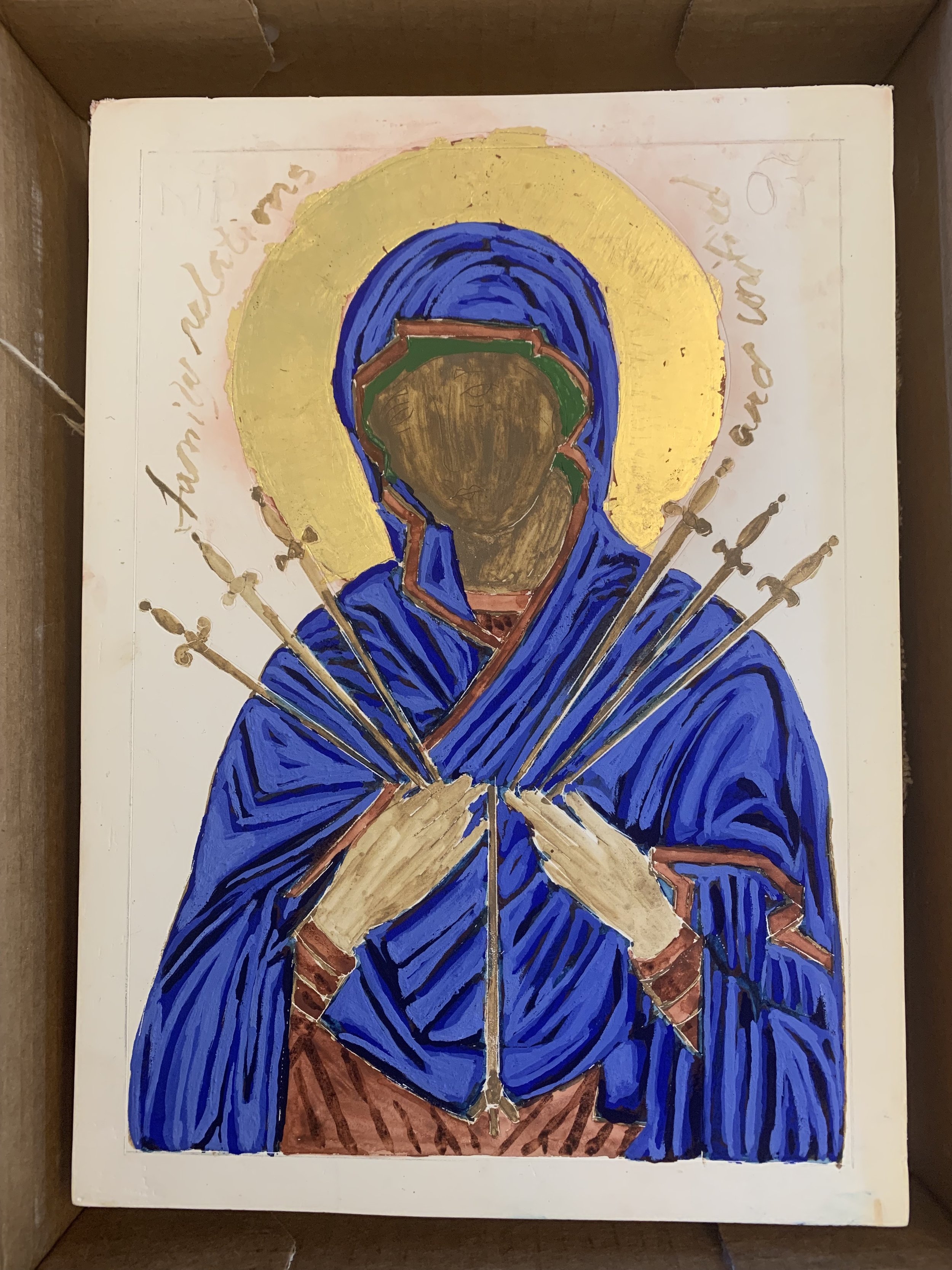
“Icons raise the soul and mind to the realm of the spirit.” (Photis Kontoglou,  greatest iconographer of 20th century Greece)

Years ago I sat entranced watching a youtube video of writing an icon. I searched for places that taught the writing using the traditional materials; I was not interested in acrylic paints and faux gold leaf. Fast forward a decade. After my intense and animated monologue about the art to a friend, who never forgot my enthusiasm, she found an icon artist who writes icons using the traditional supplies. I was invited and became the third and final student.

We began with a wooden board to which we applied pure linen using a glue made from rabbit skin granules and water cooked to the “right consistency” over a double boiler.

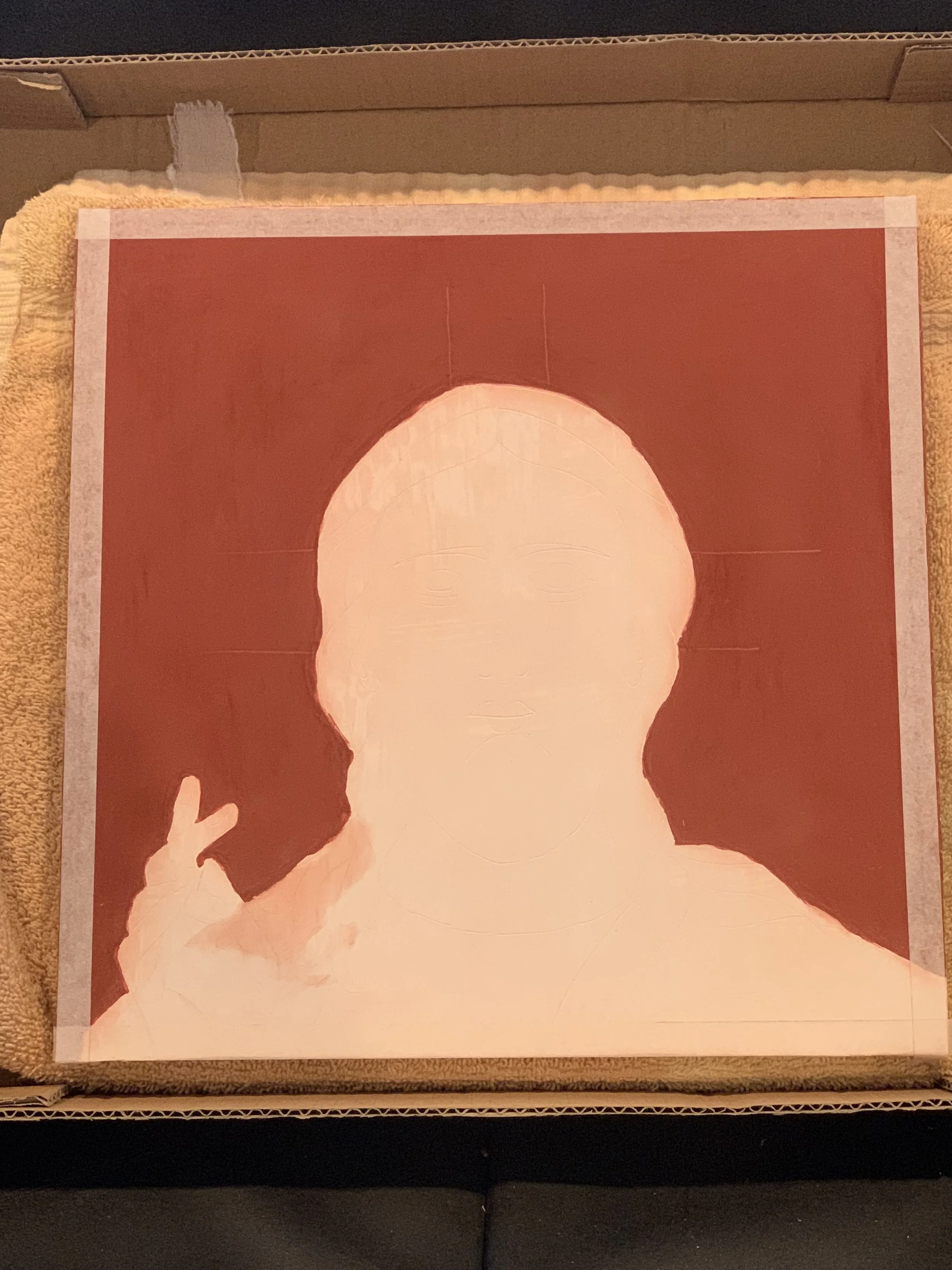
Next we applied priming gesso made from rabbit skin pellets, white marble dust and water. Each of the ten gesso layers is painted on while quietly contemplating a specific theme chosen as a group: New Beginning, Patience, Thanksgiving, Open to God’s Will, Letting God Lead, Gratitude, Letting Go, Silence, Courage, Grace. In essence we have “written” these contemplations into the icon. You must not rush the layers; every trace of wetness must be dry, but not too dry; the layers need to remain in unity. And no layer can be stronger than the one beneath it.

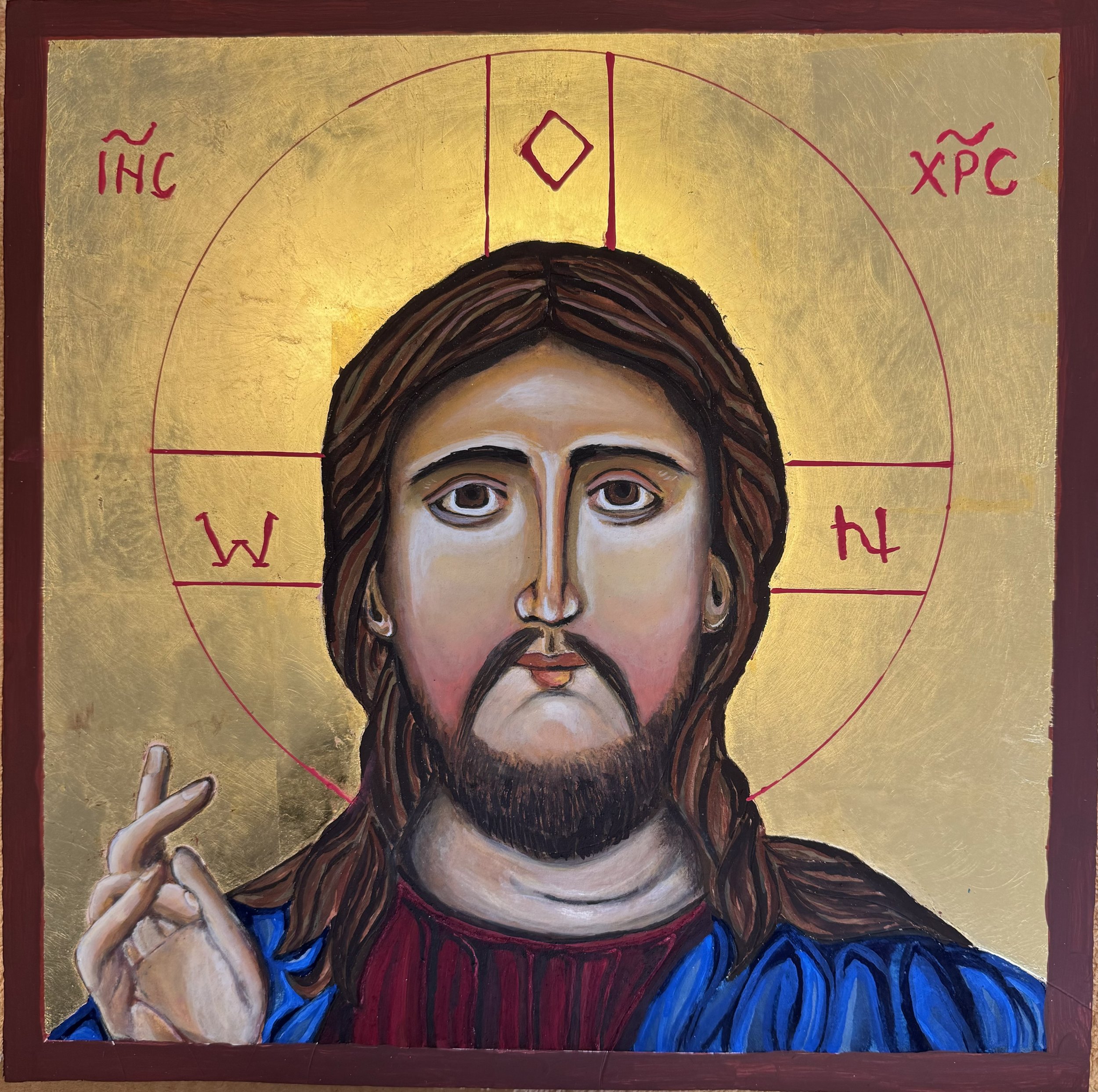
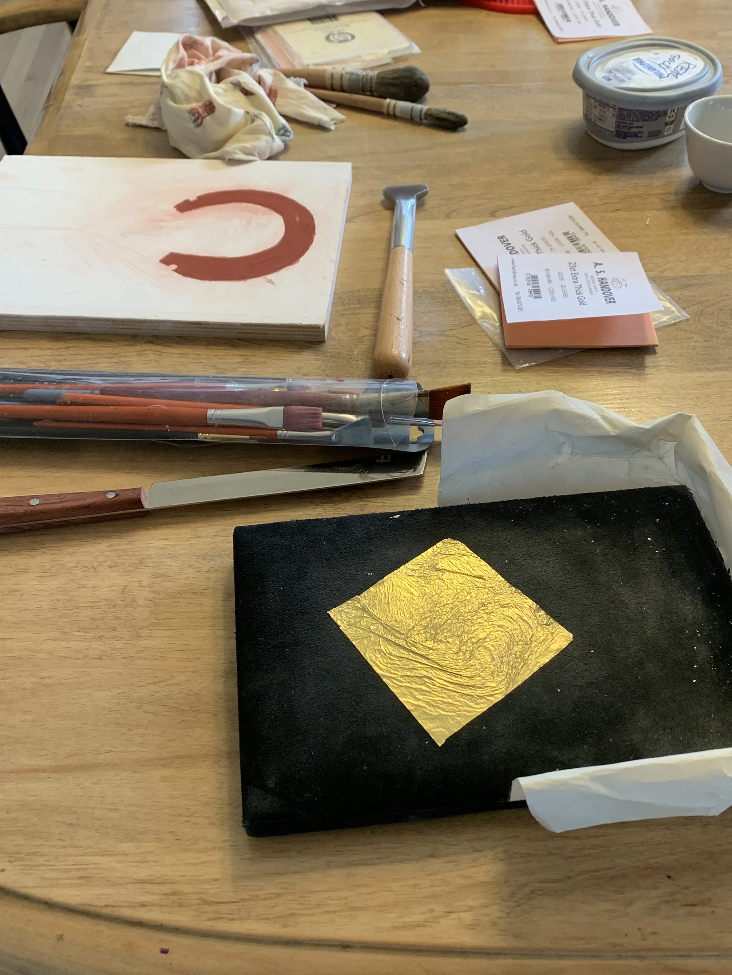
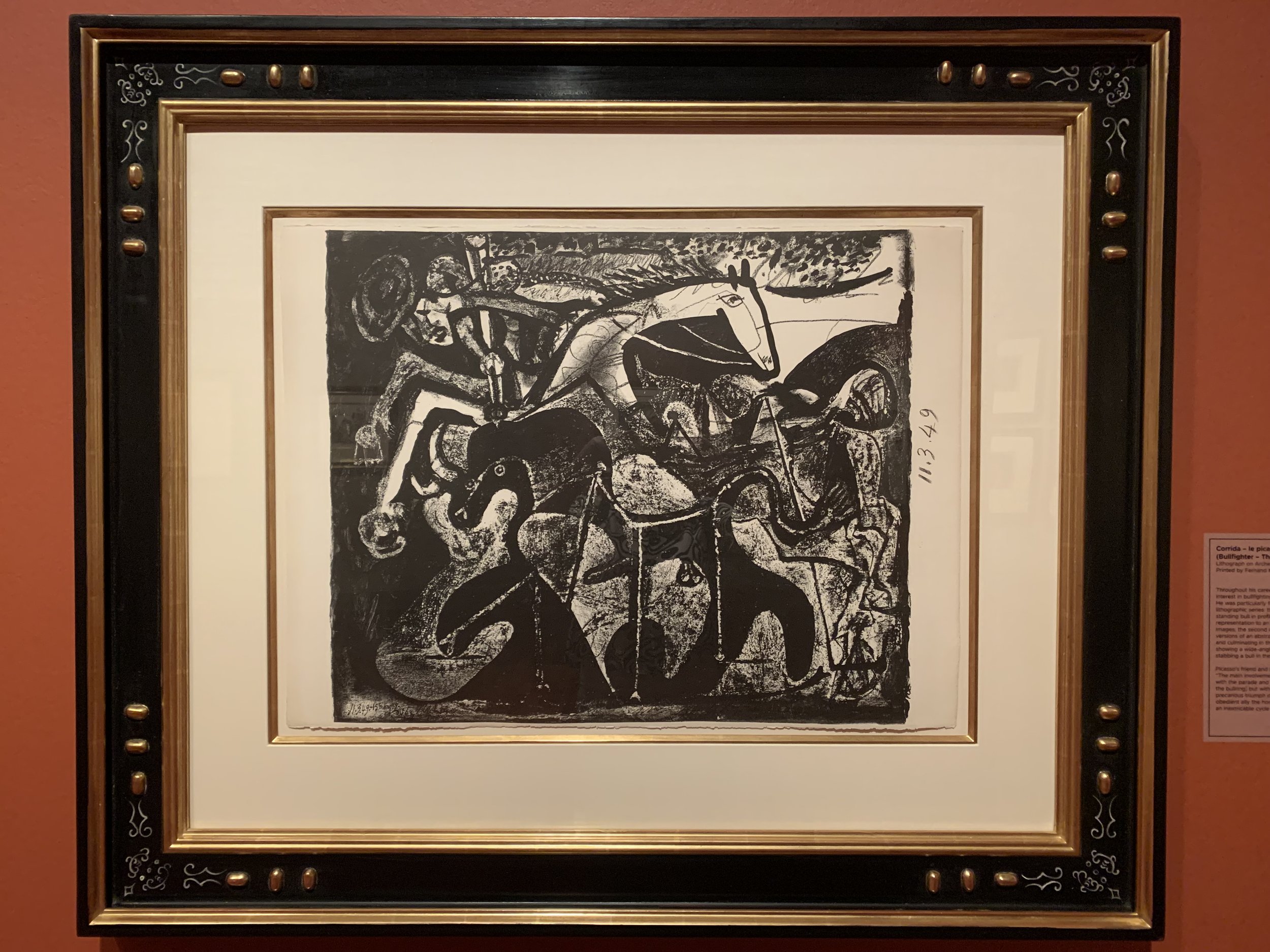
Once the panel is sanded it is ready for the gold. We used 23 carat gold leaf. The gold signifies God’s presence while the pigment colors signify the creation. As a metal, gold is distinct from pigments which are earth or stone. “So on the one hand gold (denoting God) appears completely other than the pigment (creation). On the other hand there is an intimate relationship between them.

An under layer of bole is warmed and applied wherever the gold will be laid. The gold is carefully placed on a gilder’s cushion and cut to size. Immediately before applying to the icon the bole is brushed with a mix of water and alcohol- vodka works. Using a squirrel gilder’s tip rubbed on your hair or face for a little oil, the gold is picked up and then placed over the place you’d like the gold.

My first attempt, I inadvertently got the merest bit of water on my squirrel tip and the gold quietly and quickly curdled into an unusable snake. My dear friend began to laugh but had to slowly walk away from her gold leaf lest it take flight by the slightest breath of her guffaw. 

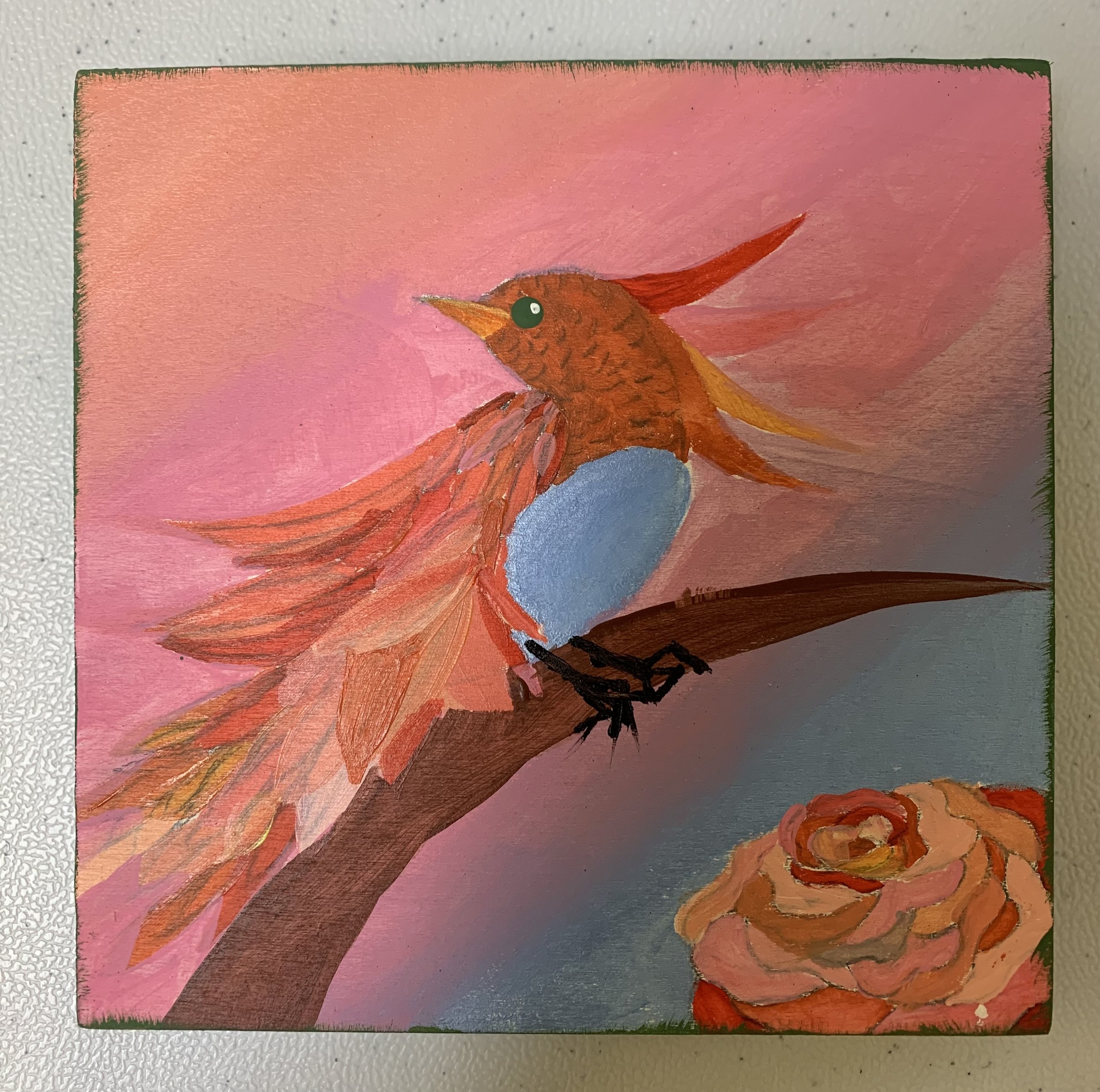
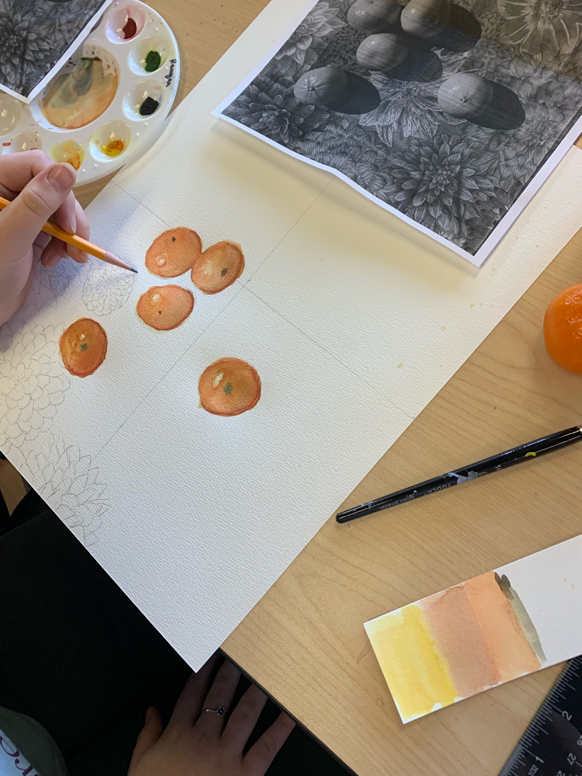
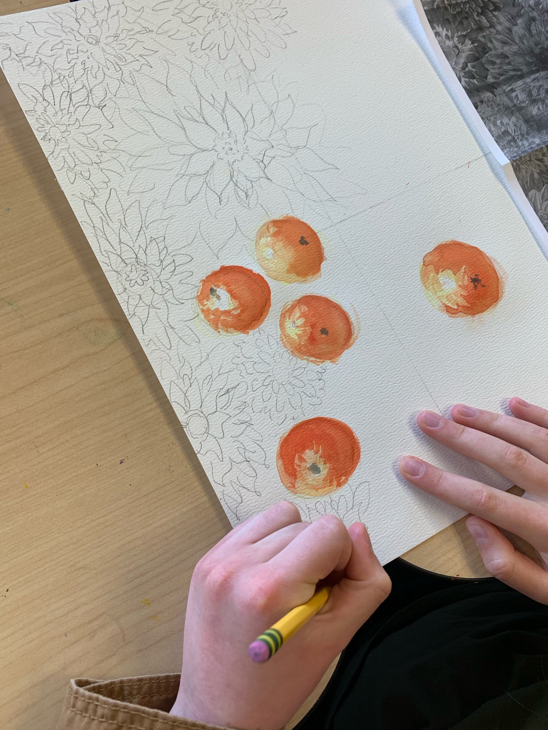
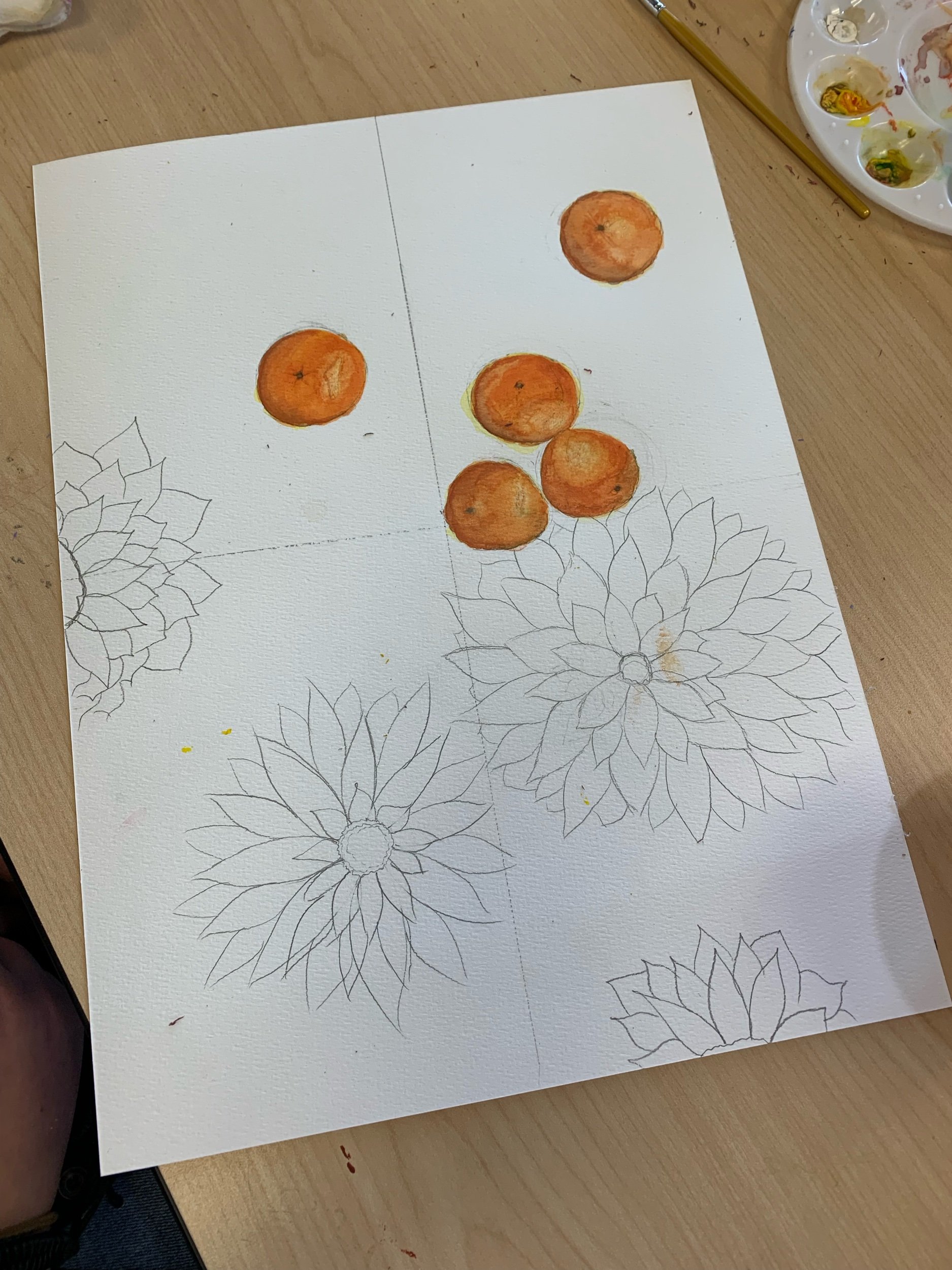
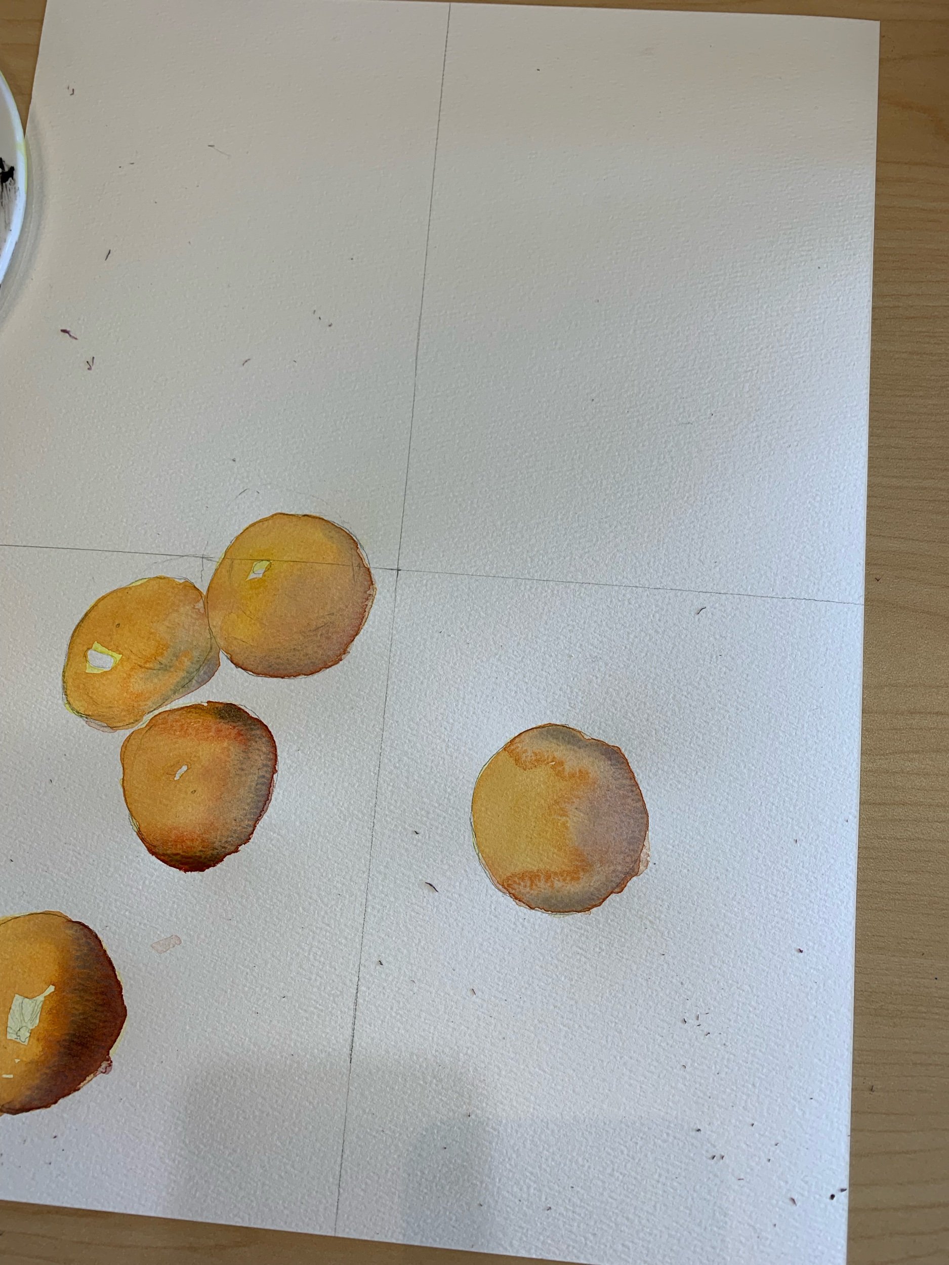
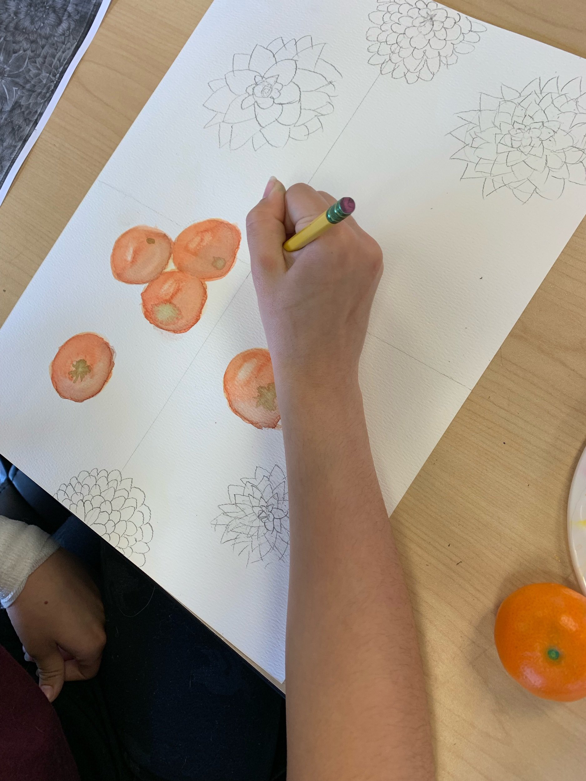
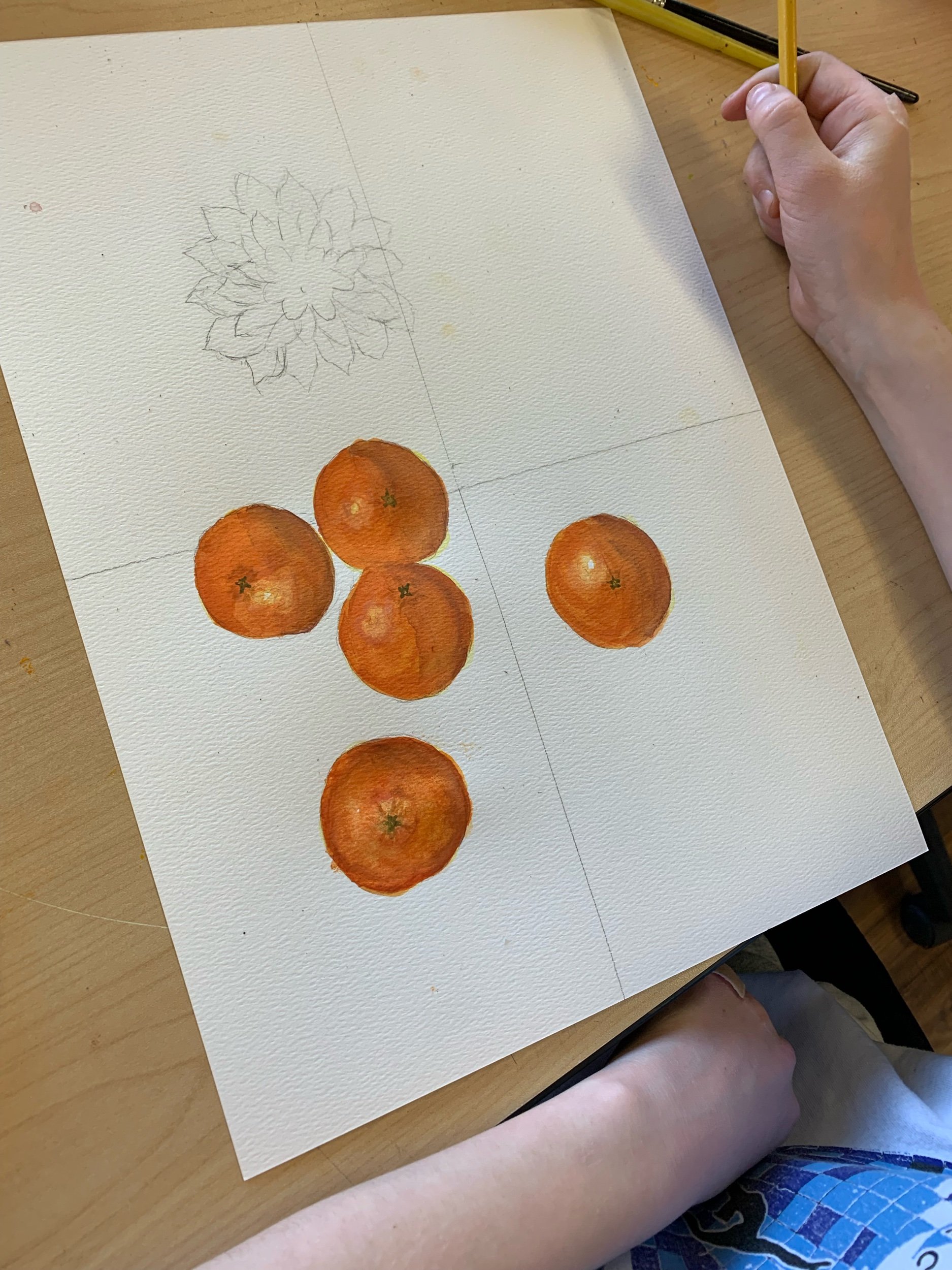
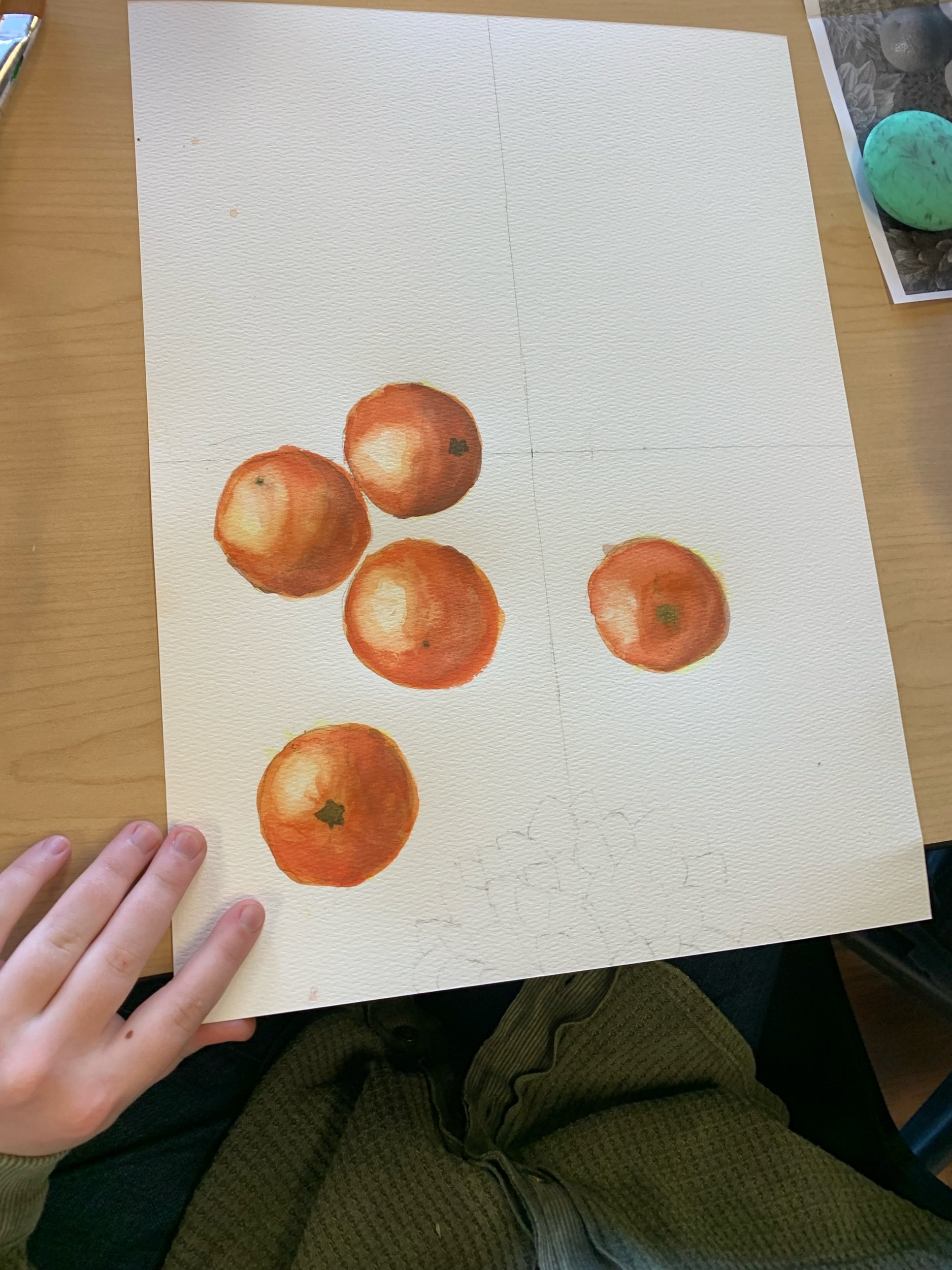
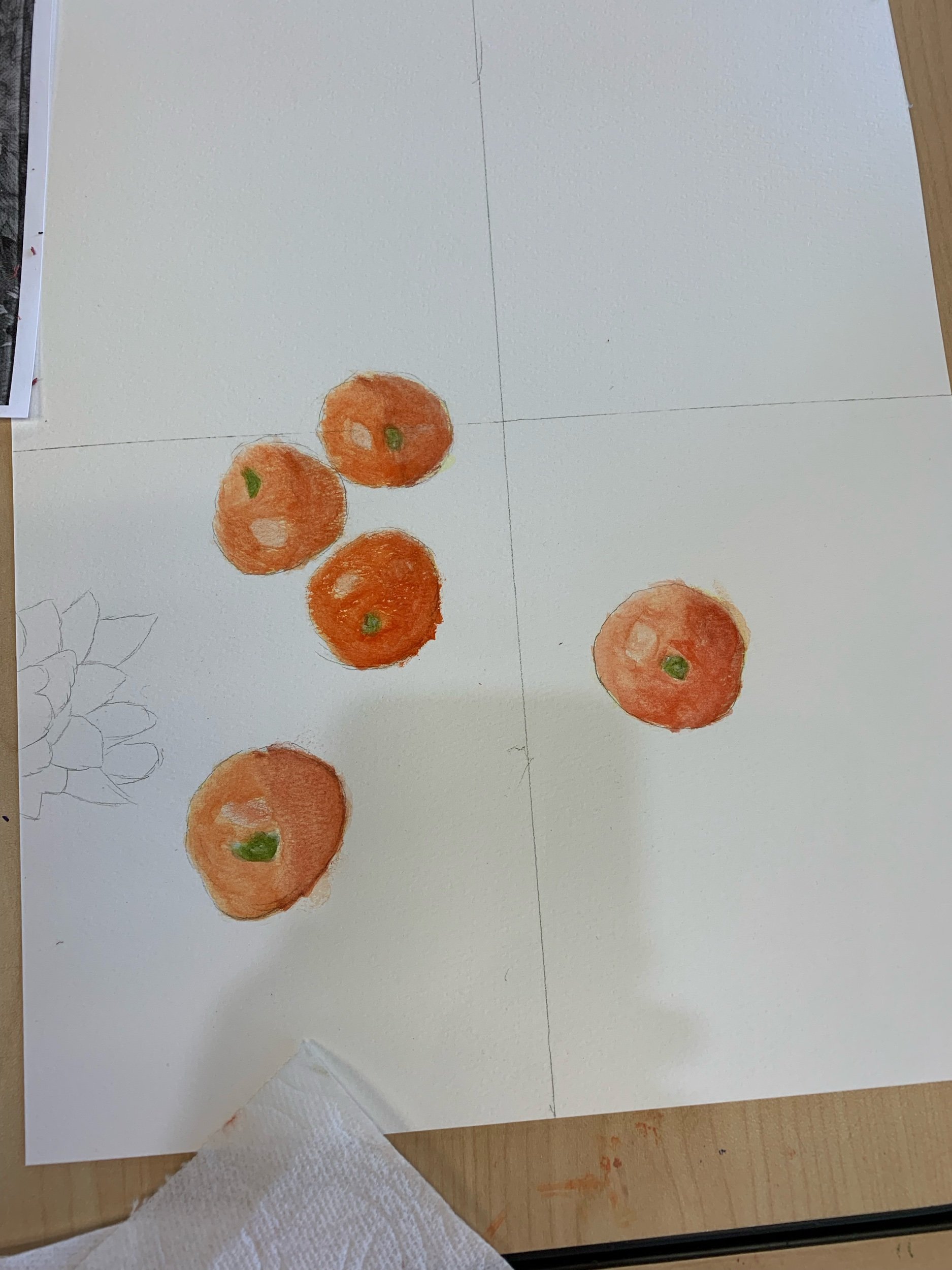
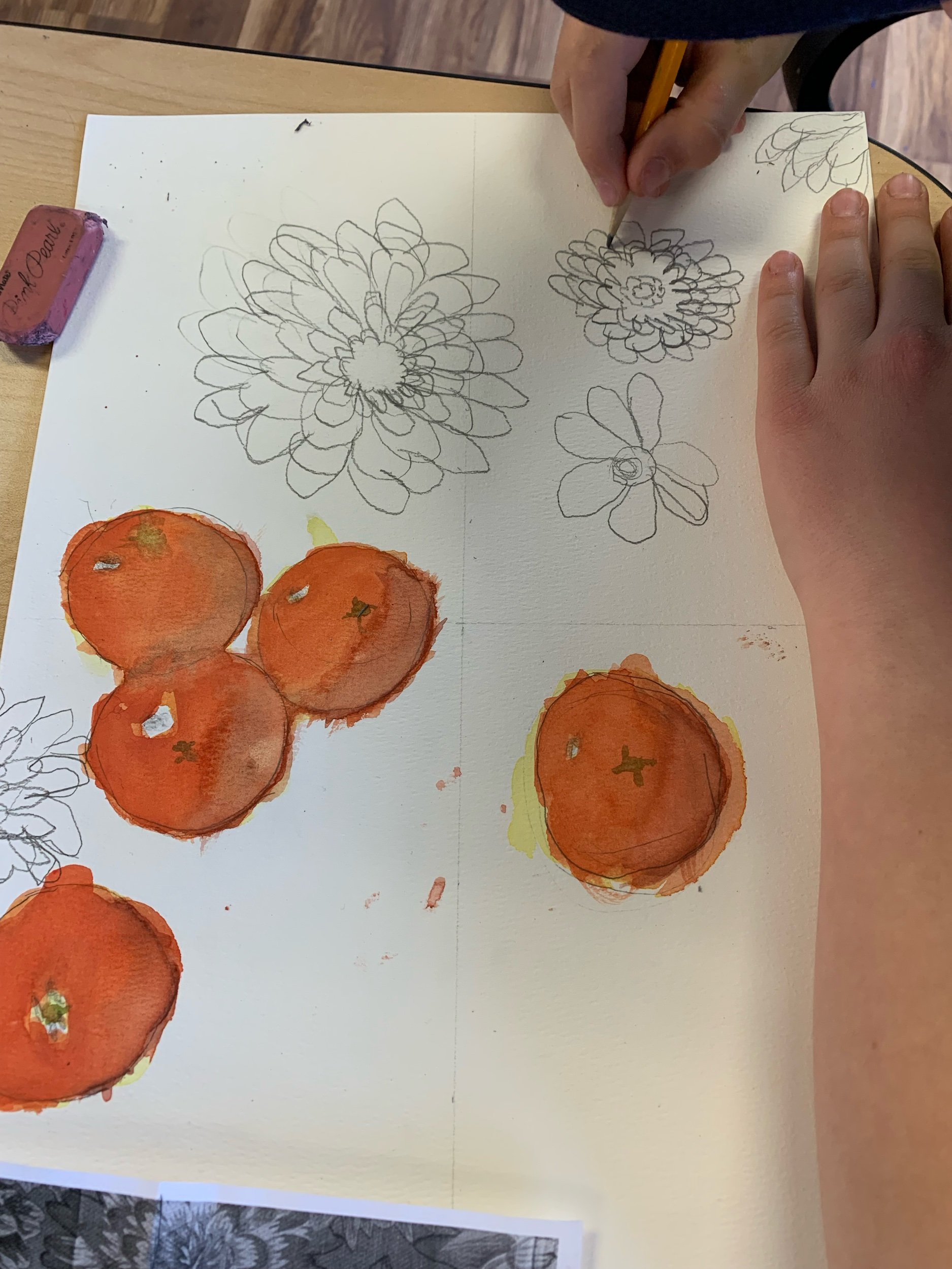
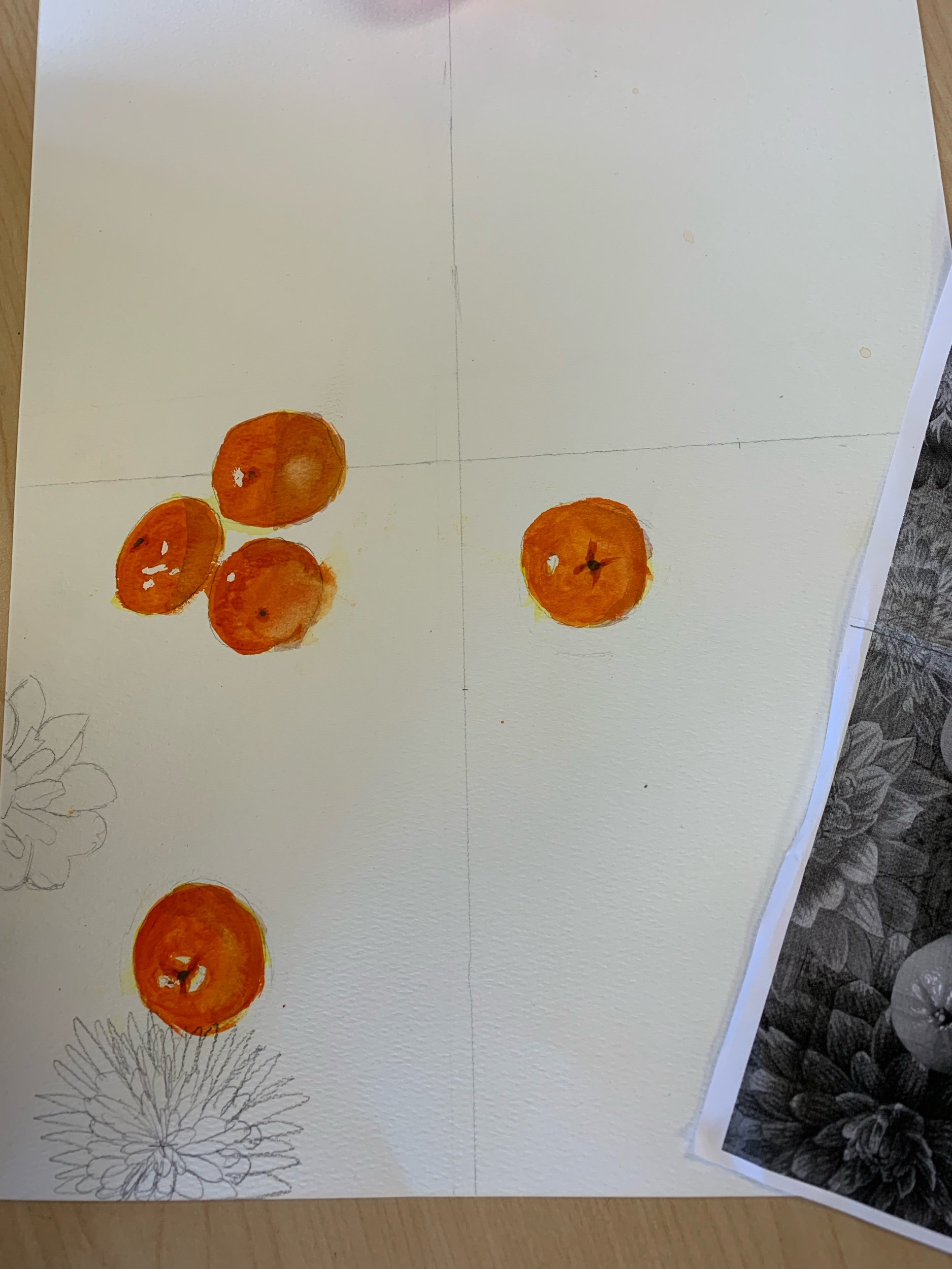
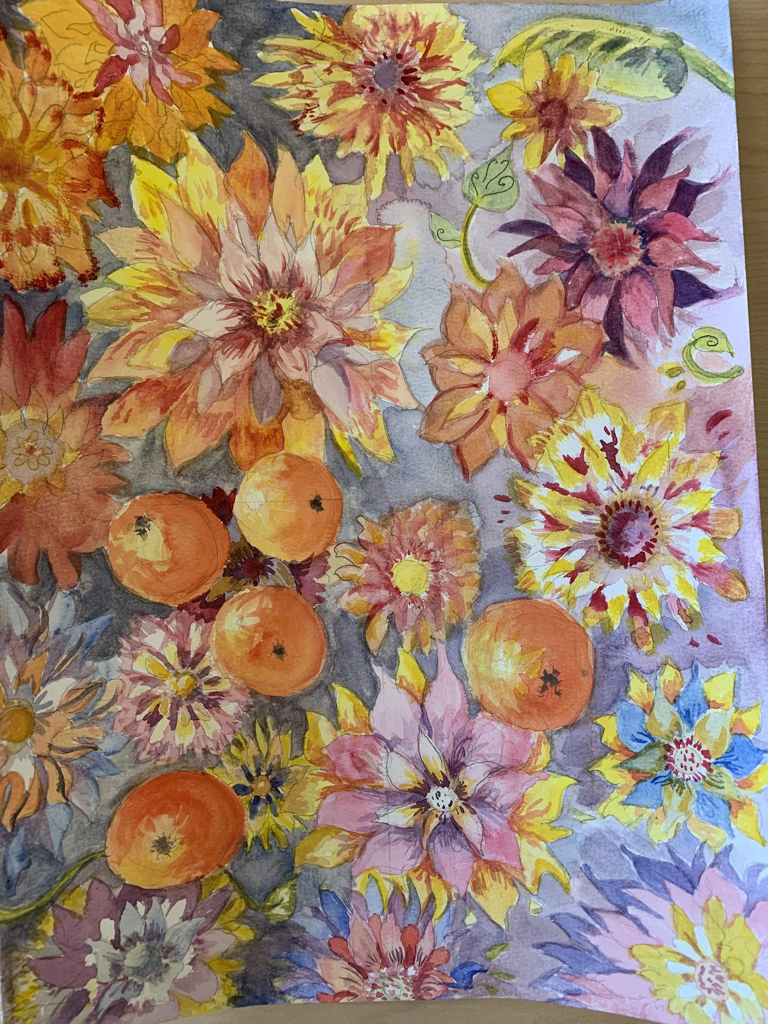
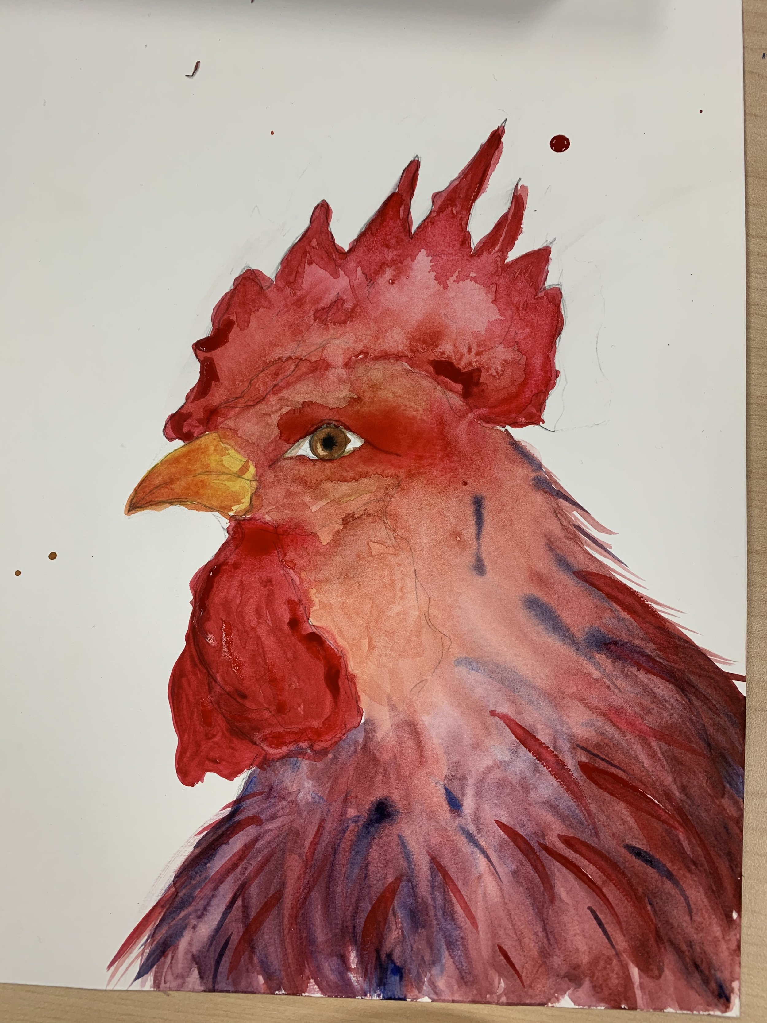
Next comes the actual painting. The colors are pure pigments from the earth mixed with the yolk of an egg. Reds, for example, are made from plants or creatures or by heating white lead.

Under the icon a prayer is written after a lot of meditation and prayer. The viewer will never see it, but the prayer is there nonetheless.

“If one is to make an icon that radiates love it must be made with love- love for the materials as well as for the subject and the viewer. Sourcing and preparing pigments helps gain a respect for them.” (Techniques of Icon and Wall Painting- Aidan Hart)

I was surprised by my absolute intimidation of the process and the respect for the materials. The process is slow and every single step has significance. My respect for this art continues to grow.


Huntsville, Alabama Museum of Art

This museum is easy to see in a few hours; it’s small.

“To think of art, or practice it as a tool for some other purpose is to sellout out to a technocratic bent of mind, damning it to a permanent identity crisis…” Calvin Seerveld

I was turned off by the rainbow 🌈 heart stickers on various pieces. Is it really necessary to the art I’m looking at to know the artists’ sex life? A piece of art should be able to hold its own without pandering. I mean, Picasso was abusive toward the women in his life, but we don’t get a warning sticker on his art about his personal life.

“Art is not a means to an end, it is not a function of something else. Art stands or falls on its own artistic contribution to the world.” Calvin Seerveld

🍊 Orange You Glad

A more complicated and step-by-step watercolor still life lesson for my older class and a simpler step-by-step for my younger class. For the older class, working from a black and white photo of the actual setup and also the actual fabric and tangerines, we began.

Linoleum Block Printing

I was excited to move my older class to the next level. In the past years we had created prints using styrofoam but this year they graduated to linoleum. The linoleum is much more resistant to cutting than the very easy styrofoam but these students rose to the occasion and created some beautiful work.

Norwegian Art

I read about a local Norwegian artist who is 86 years old and runs his own art studio. He sells acrylic paintings of Norwegian scenery of everyday life inside and out. He also carves the most endearing sculptures of everyday work. And he makes “tine” pronounced “tina.” They are round lidded boxes that were used as lunch boxes and for toting items.

We sat at listened to Joe Molvik’s life story in his small studio. And then I had to buy a tine.

Video Block
Double-click here to add a video by URL or embed code. Learn more

Watercolor on the grid

Our mind likes to play tricks on us, even when we’re trying to draw accurately. I introduce the grid as a way to get the perspective accurate. And then we continued with watercolor technique for some really great results.

Fat Cat 🐱

My goal for this lesson was to completely fill the space. Too often younger artists make use of a small section of their paper and the rest is empty. The goal was to make this cat almost bust out of the paper.

Roosters 🐔

My older class is learning some watercolor technique while painting a rooster. Wet in wet, wet on dry, and dry on dry. No two roosters looked alike because all the drawing was free hand. They could choose to paint just the head or the whole body. I had some color reference photos to gather inspiration but it was up to each student if they wanted to try and stick to true rooster colors or go whimsical.

This class also had the option of the dry watercolor boxed paint or creating their own palette with wet tube paint on their own pallet.