🍊 Orange You Glad

A more complicated and step-by-step watercolor still life lesson for my older class and a simpler step-by-step for my younger class. For the older class, working from a black and white photo of the actual setup and also the actual fabric and tangerines, we began.

Linoleum Block Printing

I was excited to move my older class to the next level. In the past years we had created prints using styrofoam but this year they graduated to linoleum. The linoleum is much more resistant to cutting than the very easy styrofoam but these students rose to the occasion and created some beautiful work.

Norwegian Art

I read about a local Norwegian artist who is 86 years old and runs his own art studio. He sells acrylic paintings of Norwegian scenery of everyday life inside and out. He also carves the most endearing sculptures of everyday work. And he makes “tine” pronounced “tina.” They are round lidded boxes that were used as lunch boxes and for toting items.

We sat at listened to Joe Molvik’s life story in his small studio. And then I had to buy a tine.

Video Block
Double-click here to add a video by URL or embed code. Learn more

Watercolor on the grid

Our mind likes to play tricks on us, even when we’re trying to draw accurately. I introduce the grid as a way to get the perspective accurate. And then we continued with watercolor technique for some really great results.

Fat Cat 🐱

My goal for this lesson was to completely fill the space. Too often younger artists make use of a small section of their paper and the rest is empty. The goal was to make this cat almost bust out of the paper.

Roosters 🐔

My older class is learning some watercolor technique while painting a rooster. Wet in wet, wet on dry, and dry on dry. No two roosters looked alike because all the drawing was free hand. They could choose to paint just the head or the whole body. I had some color reference photos to gather inspiration but it was up to each student if they wanted to try and stick to true rooster colors or go whimsical.

This class also had the option of the dry watercolor boxed paint or creating their own palette with wet tube paint on their own pallet.

Reluctant Artist...

This guy has graciously shown up for private art classes for a full year. When he first came, I reminded him he could hardly draw a straight line. Not really but he needed improvement. With his mom’s request of “strictly drawing,” we did just that- pencil, paper, eraser. (At Christmastime I let him burst into a bit of color with a winter scene in watercolor.)

I was so glad to get his recent call asking for another year of art!

Getty Museum

The Getty museum building on its own is a glittering white marble art piece. The ride up the hill in their tram is worth the trip just for that view. And then you get to see the amazing art collection as well.

Clymer Art Museum Solo Show

This is a thrill for me to get my own show and have the very talented, Matthew Lennon, curate. To be able to drop off my art and know he will arrange and hang the show perfectly is a privilege. Andrew and I enjoyed the reception complete with a lovely glass of wine.

One of the things about being at your own show incognito is getting to hear the patrons’ comments about the work without them feeling like they need to filter.

Actual Linoleum Blocks

The high school class worked diligently and created some great art.

A few little mishaps with the linoleum cutter but thankfully band aids were available. I’m thrilled with the creative designs. Next week we print. I’ve discovered that acrylic paint definitely does not work as well as screen printing ink. Acrylic is too fluid and doesn’t adhere to the brayer to give a good even coat to the block.

When Life Hands You Lemons

My one hour class had the opportunity to meet for two straight hours in make up of an hour during spring break. I loved the little slower, less frantic pace. We worked in acrylic to paint a lemon branch. I had two of my own paintings for reference and various examples of the leaf shape and veins on the leaves.

One little girl finished her pieced and said, “This is the best painting I’ve ever done.”

Scrimshaw

Historically speaking, scrimshaw artists (aka “scrimshanders”) were whalemen, sailors, navy tars and merchant seamen who made their living on the sea. Life on a whaling vessel was often quite monotonous waiting for a whale sighting. Creating intricate art on the available materials was a great way to pass the time. Whaling voyages averaged 46 months. They used materials taken from sea animals, mainly whales but also porpoises, walruses, and even mollusks. They tended to depict nautical scenes and motifs: ships, flags, anchors, and so on.

It was a pleasure and an honor to pass the art of scrimshaw on to these artisans.

Jasper Johns and Andy Warhol

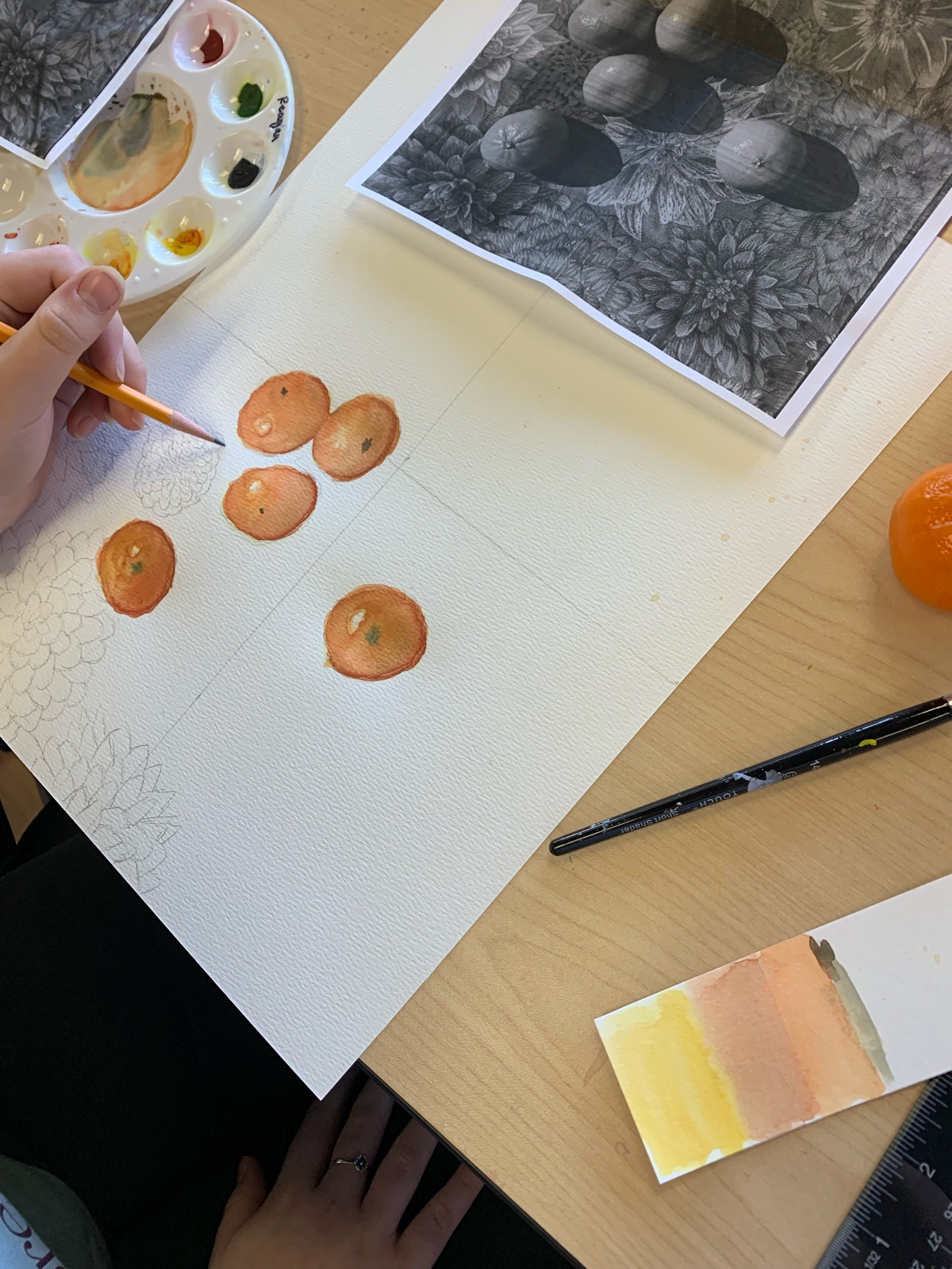
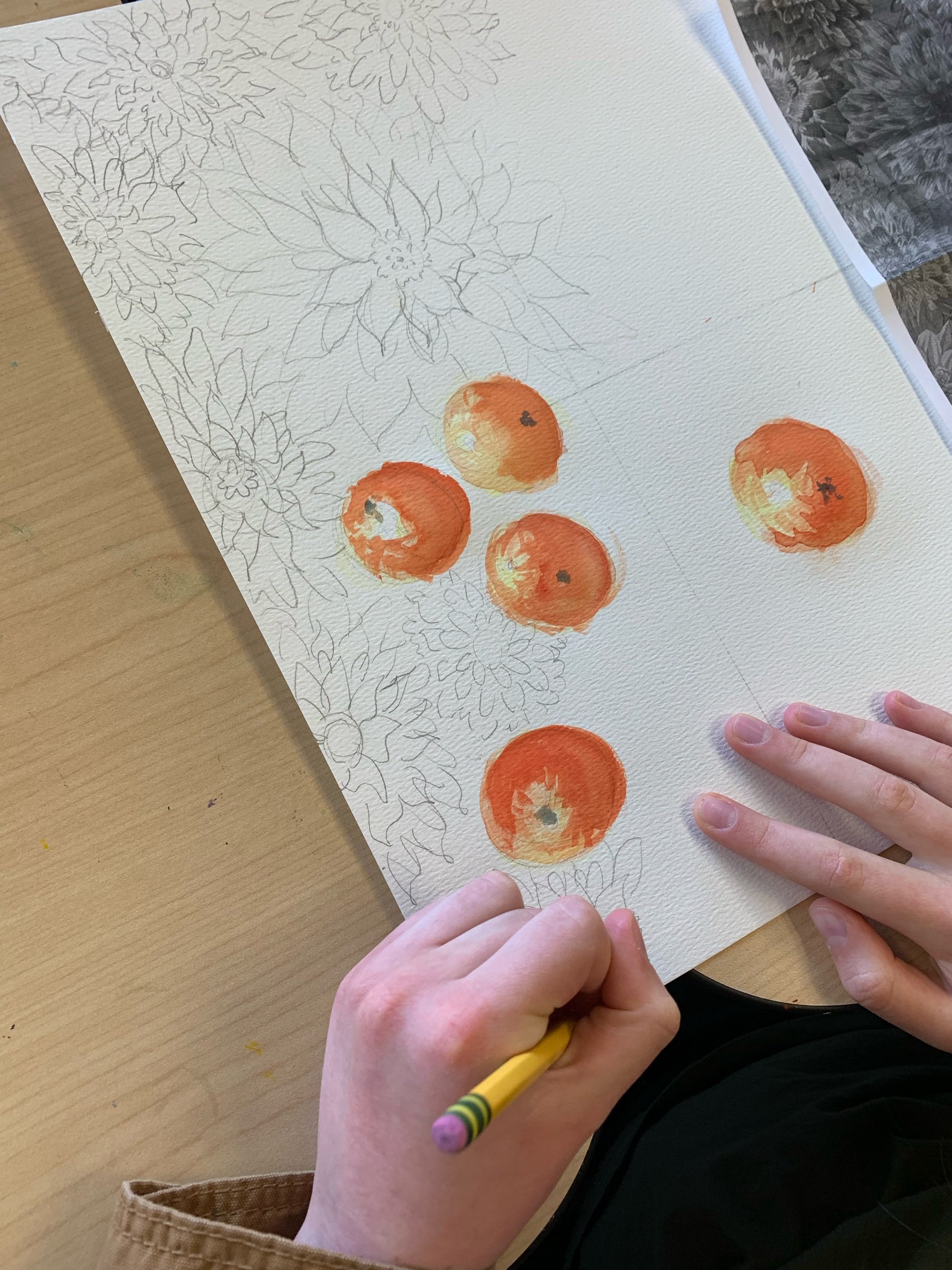
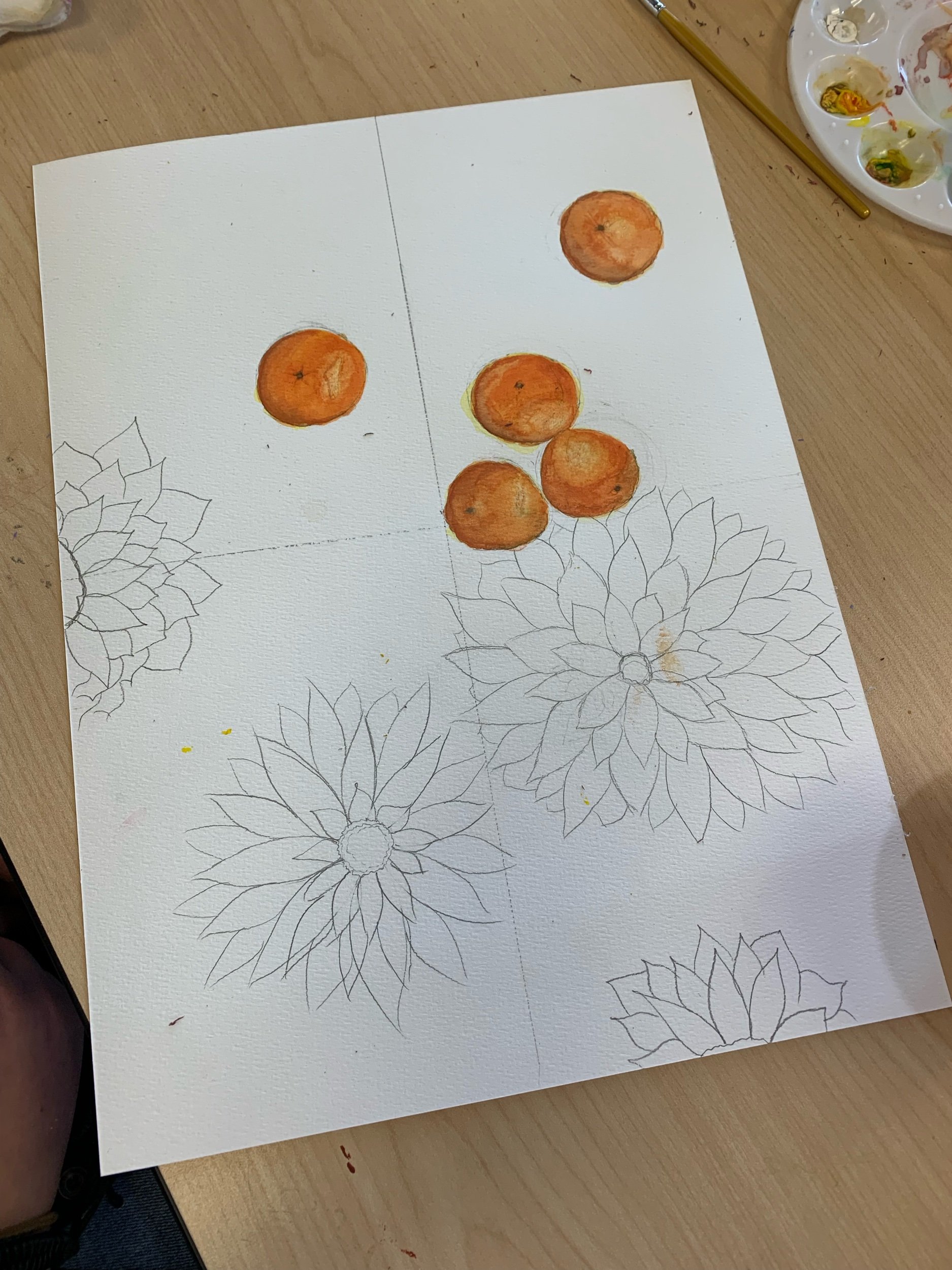
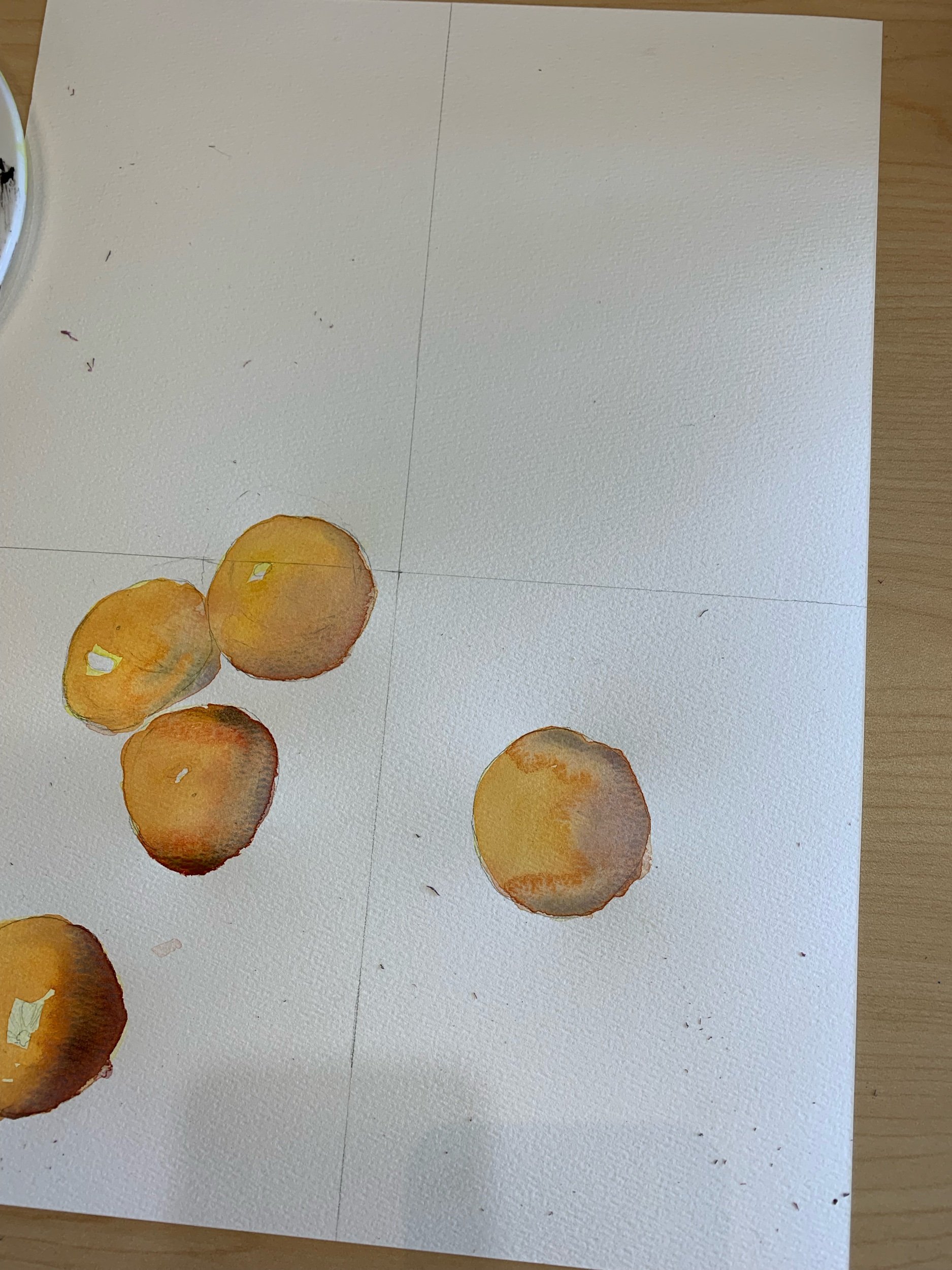
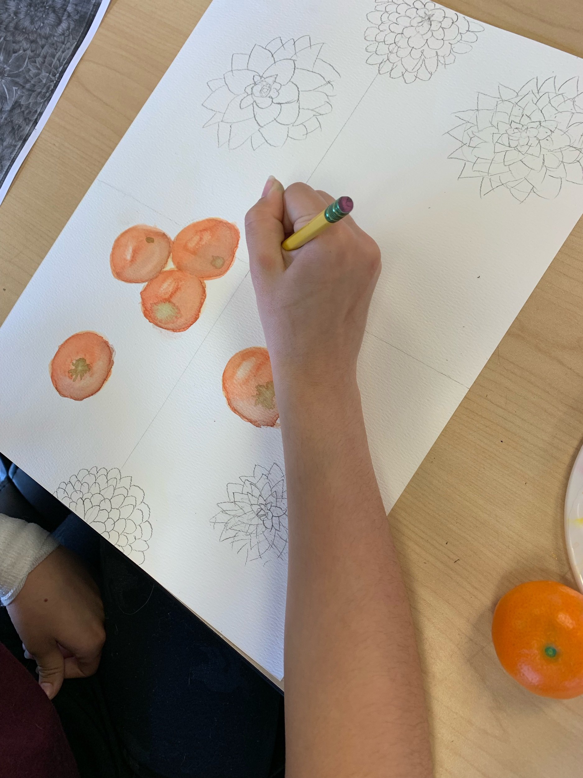
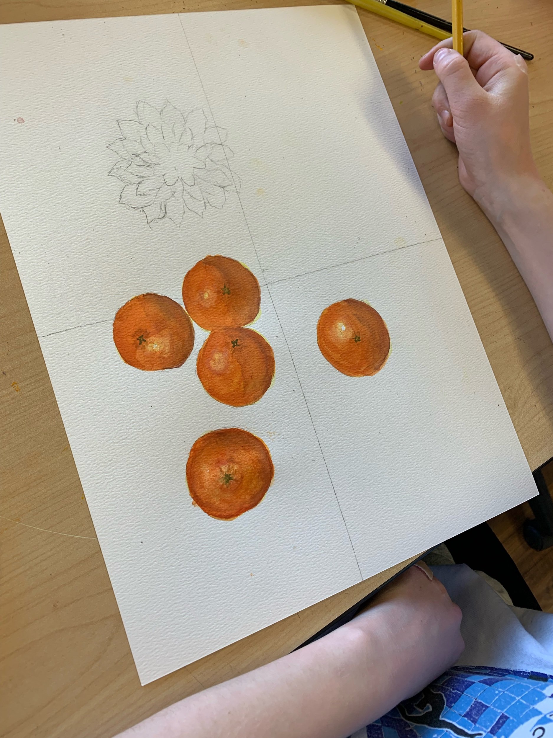
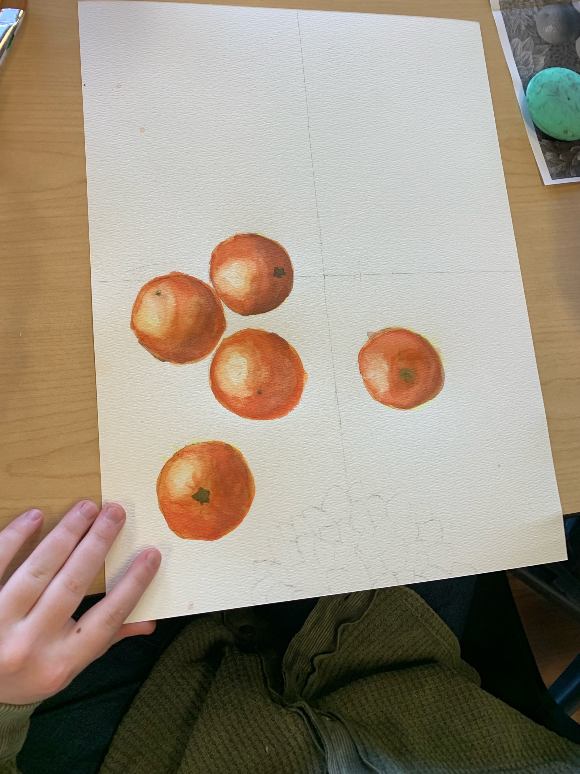
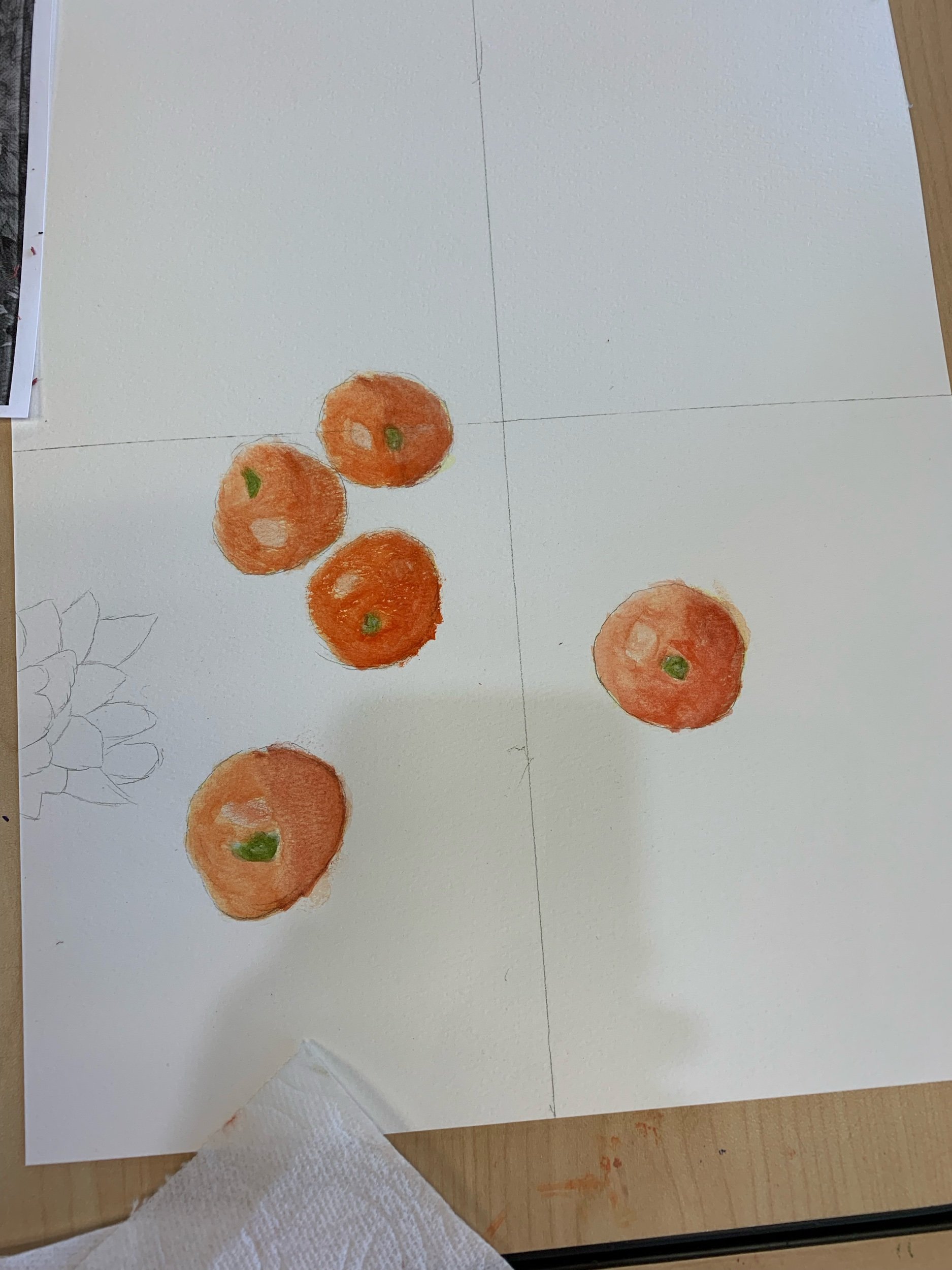
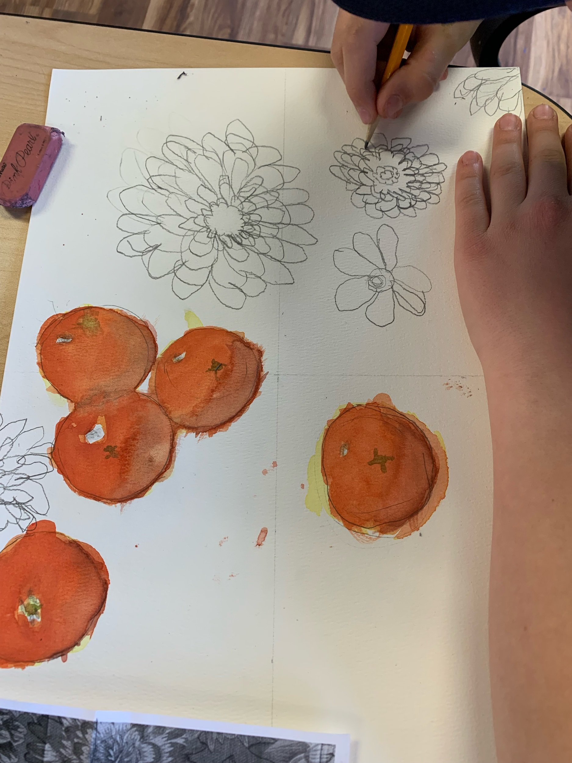
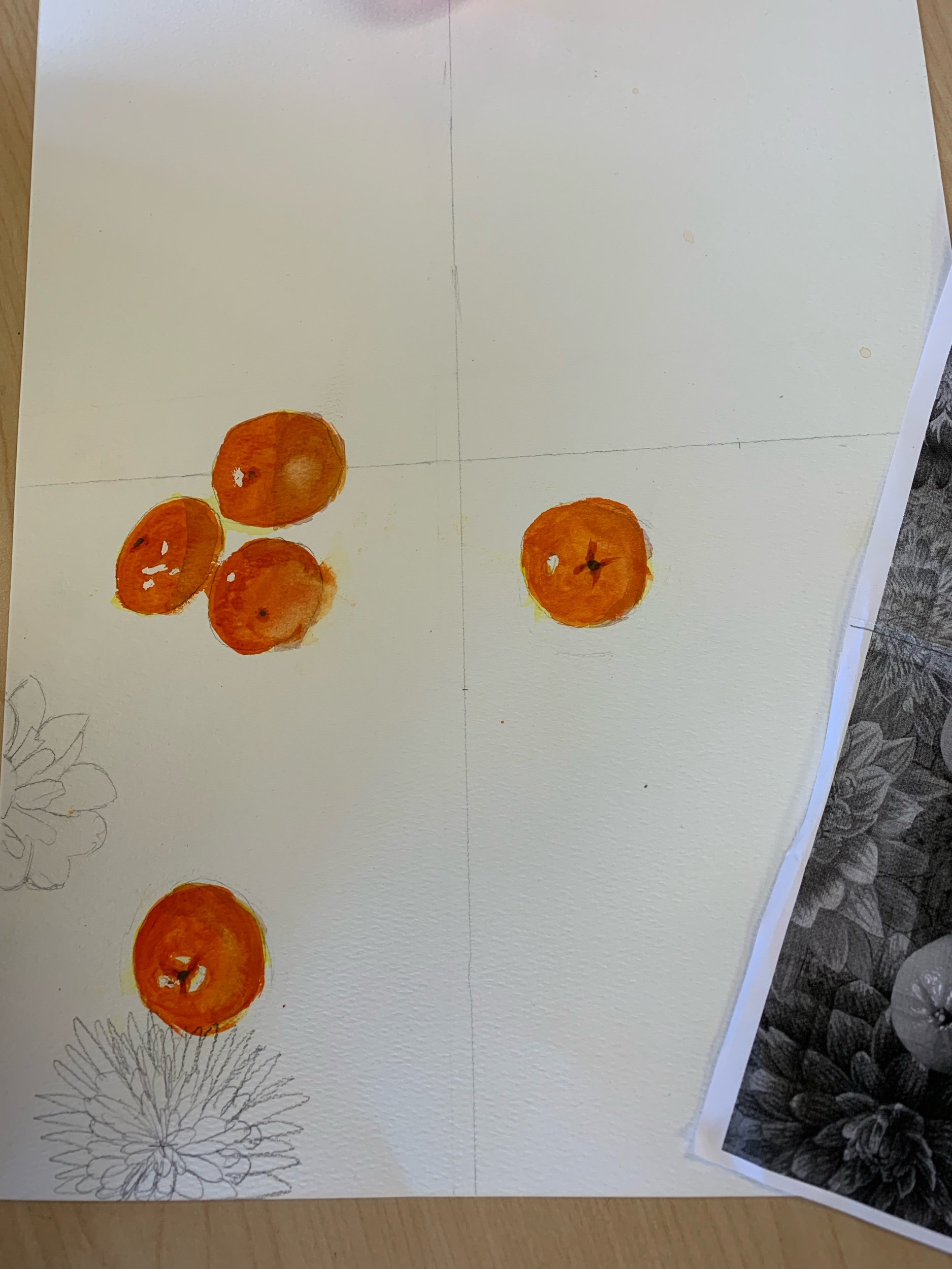
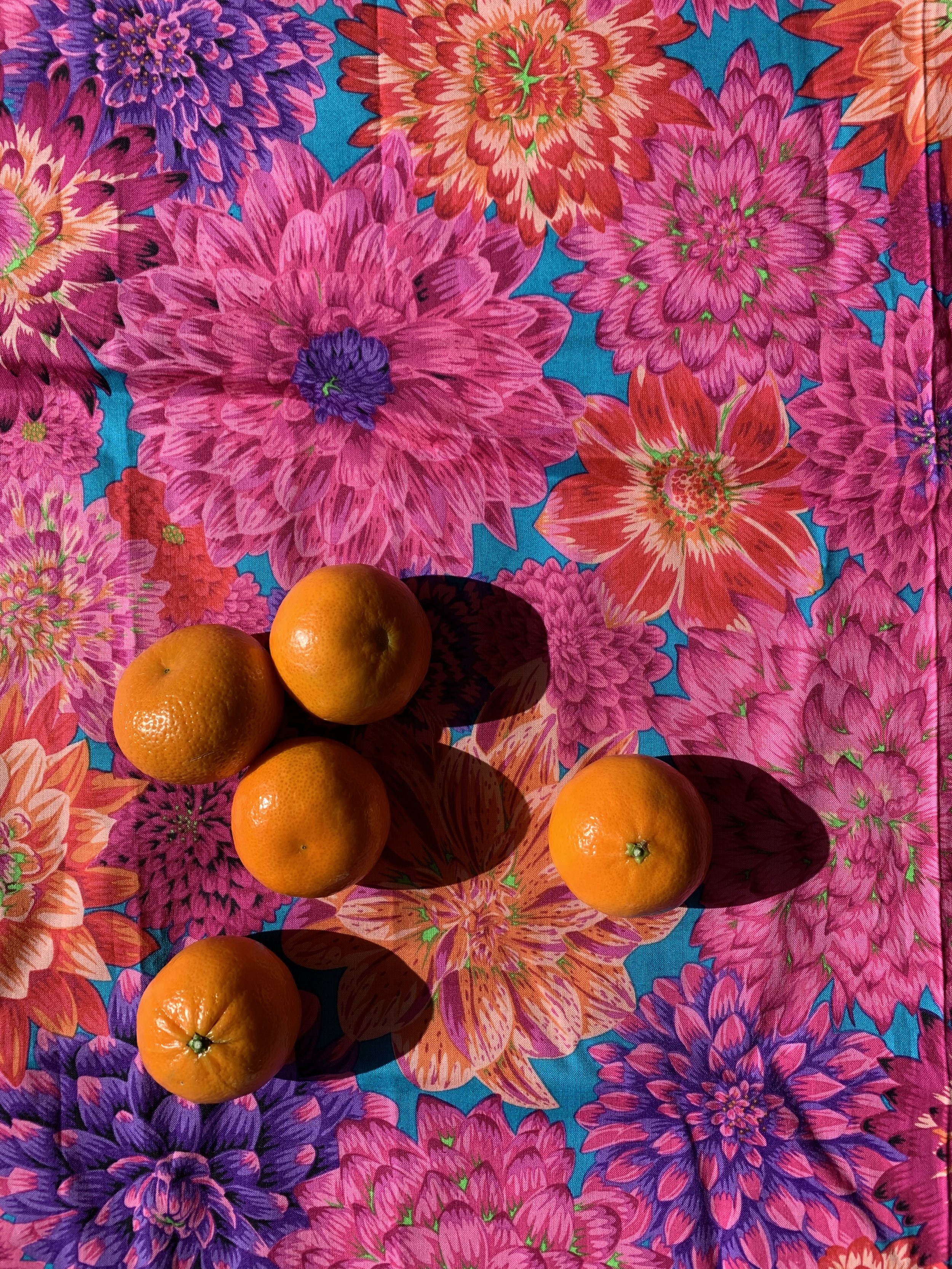
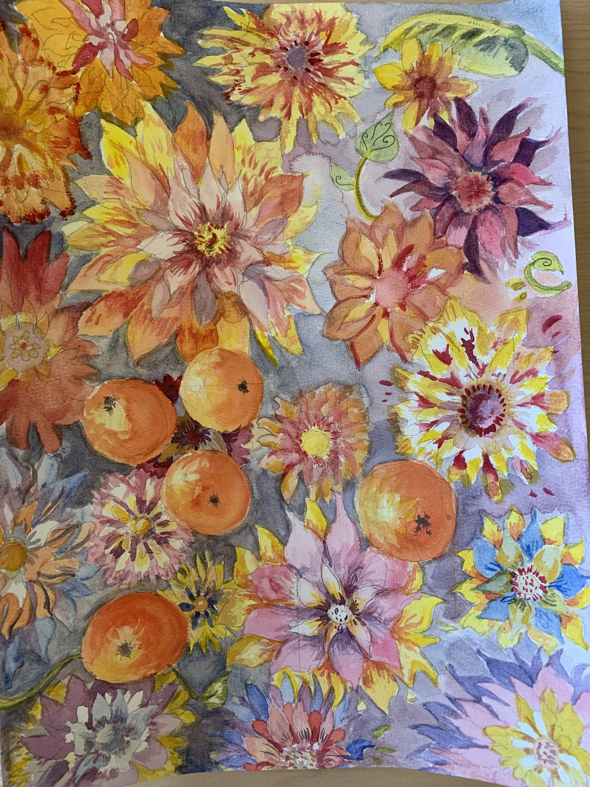
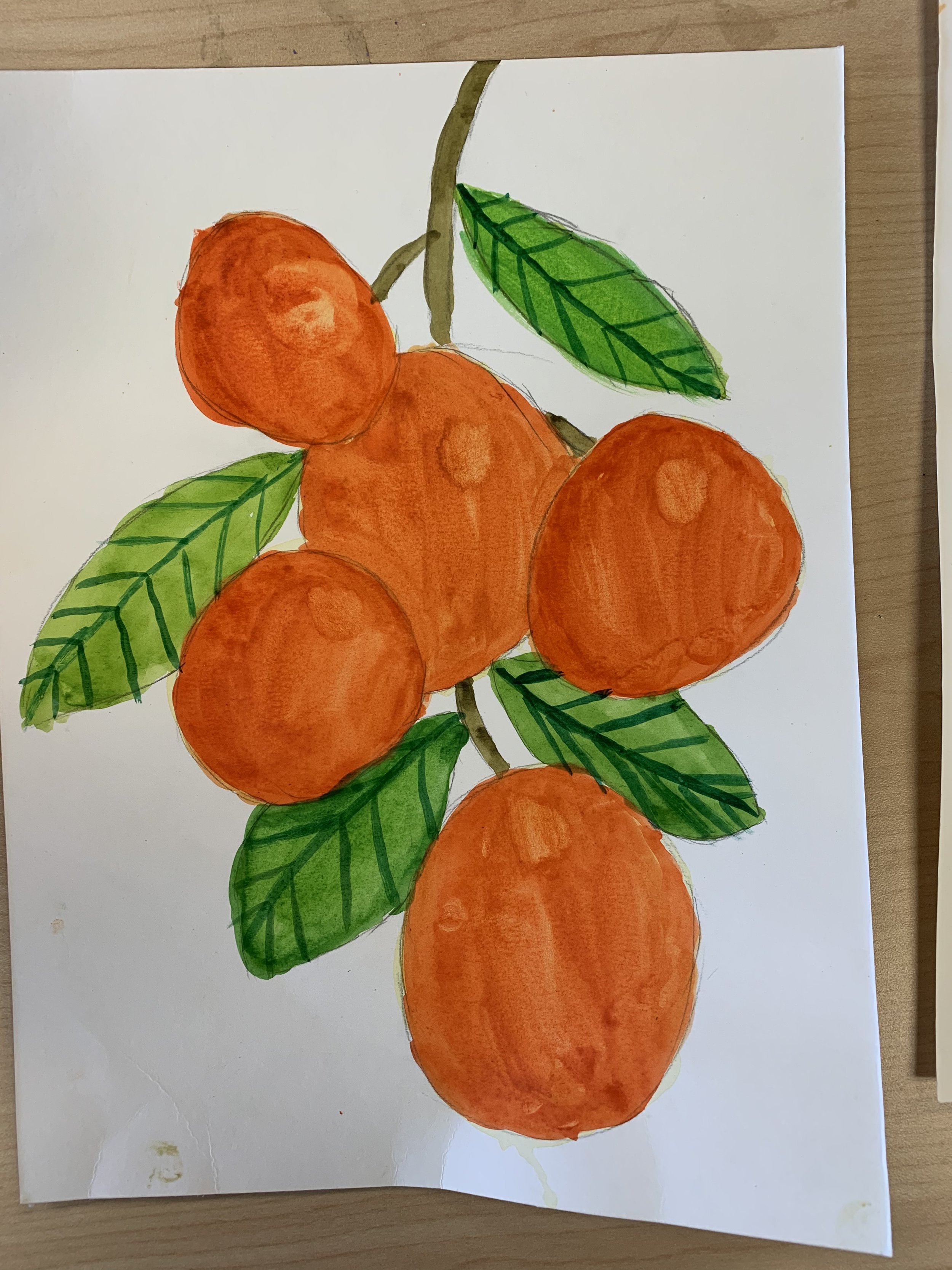
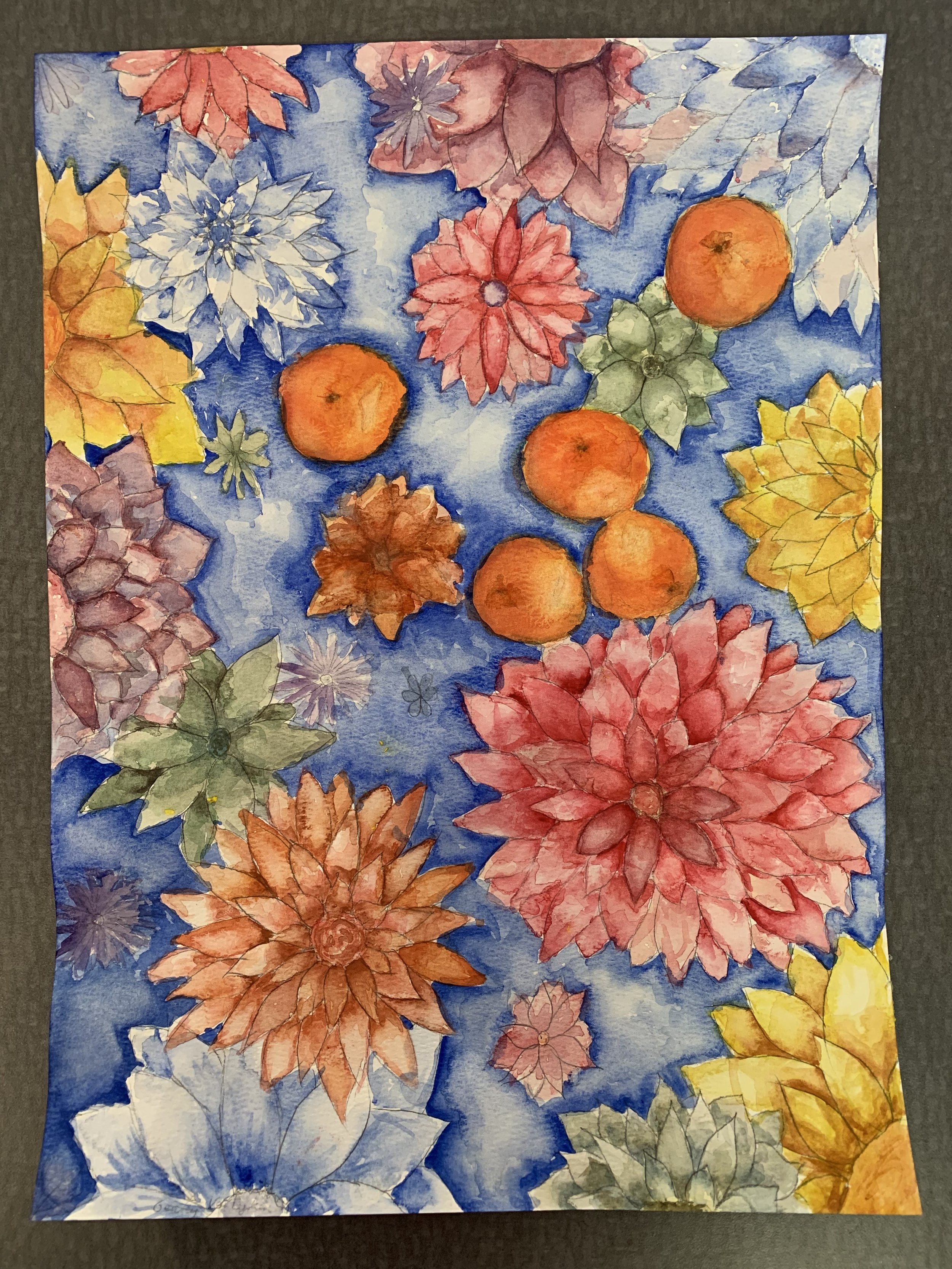
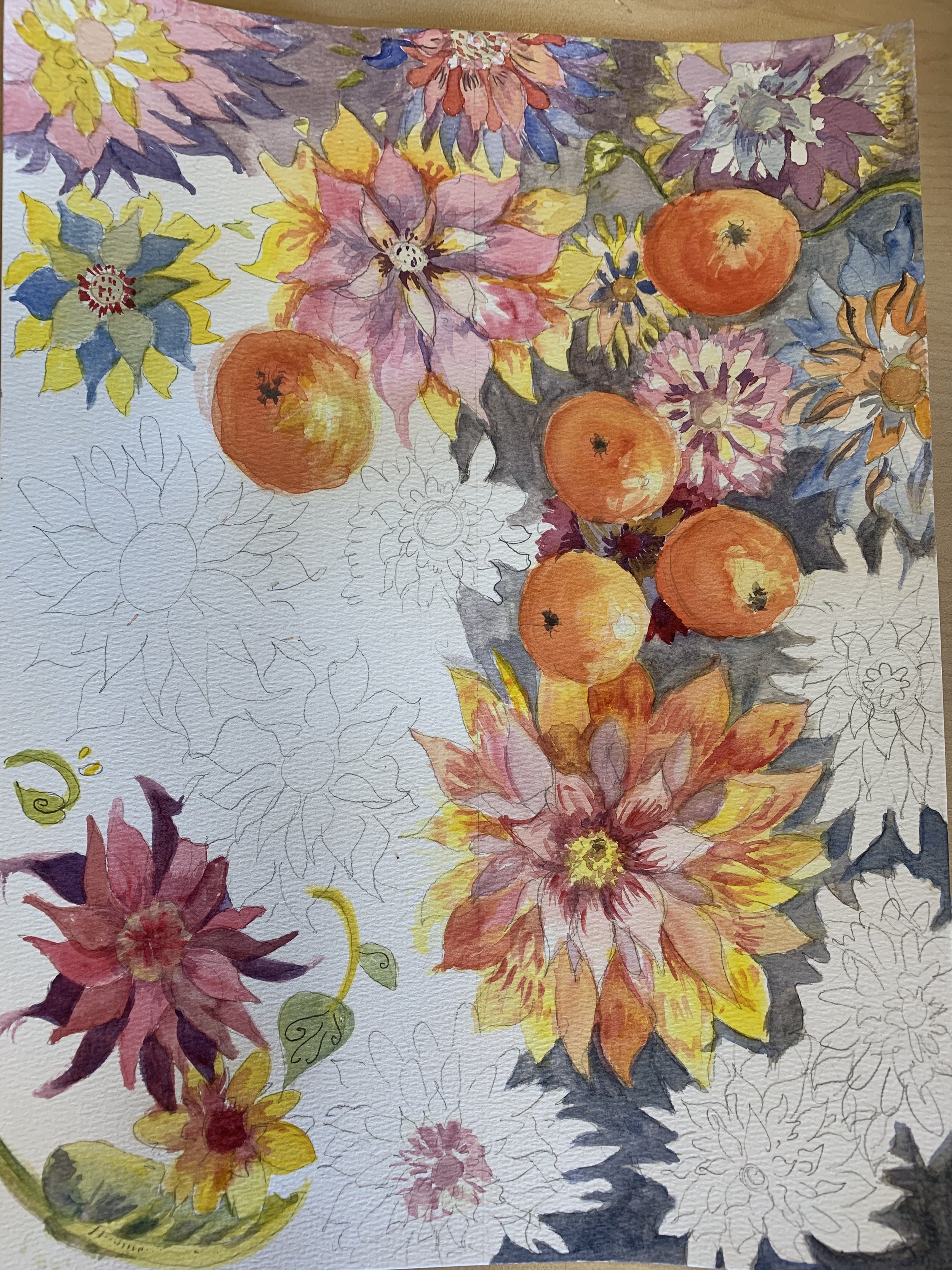
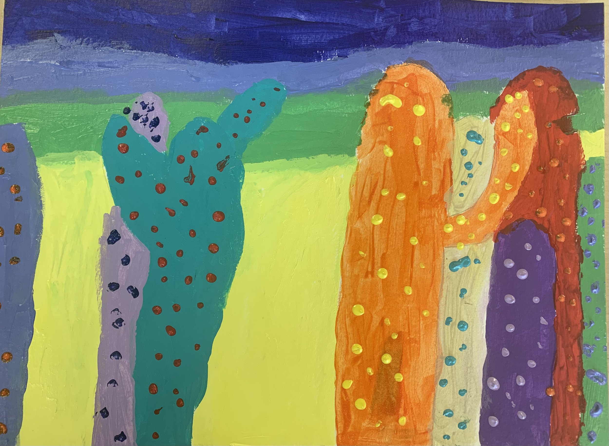
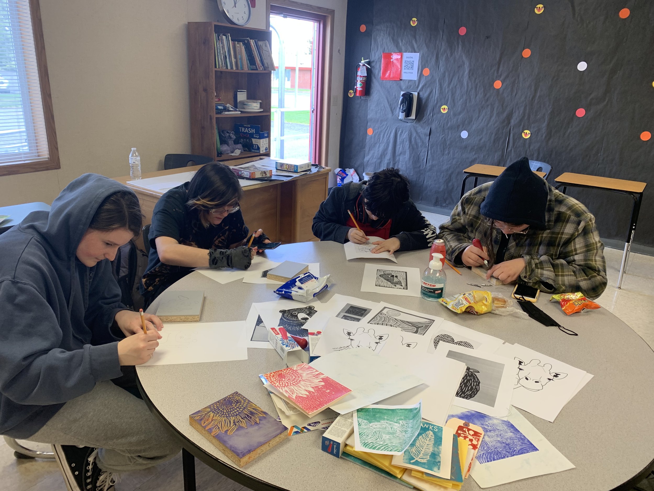
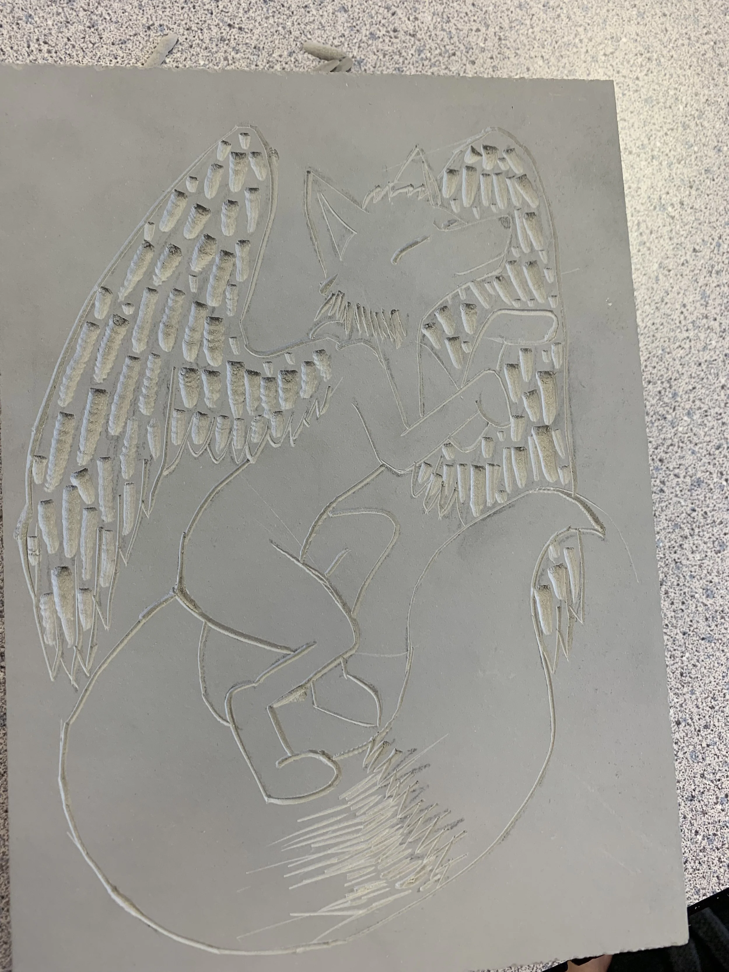
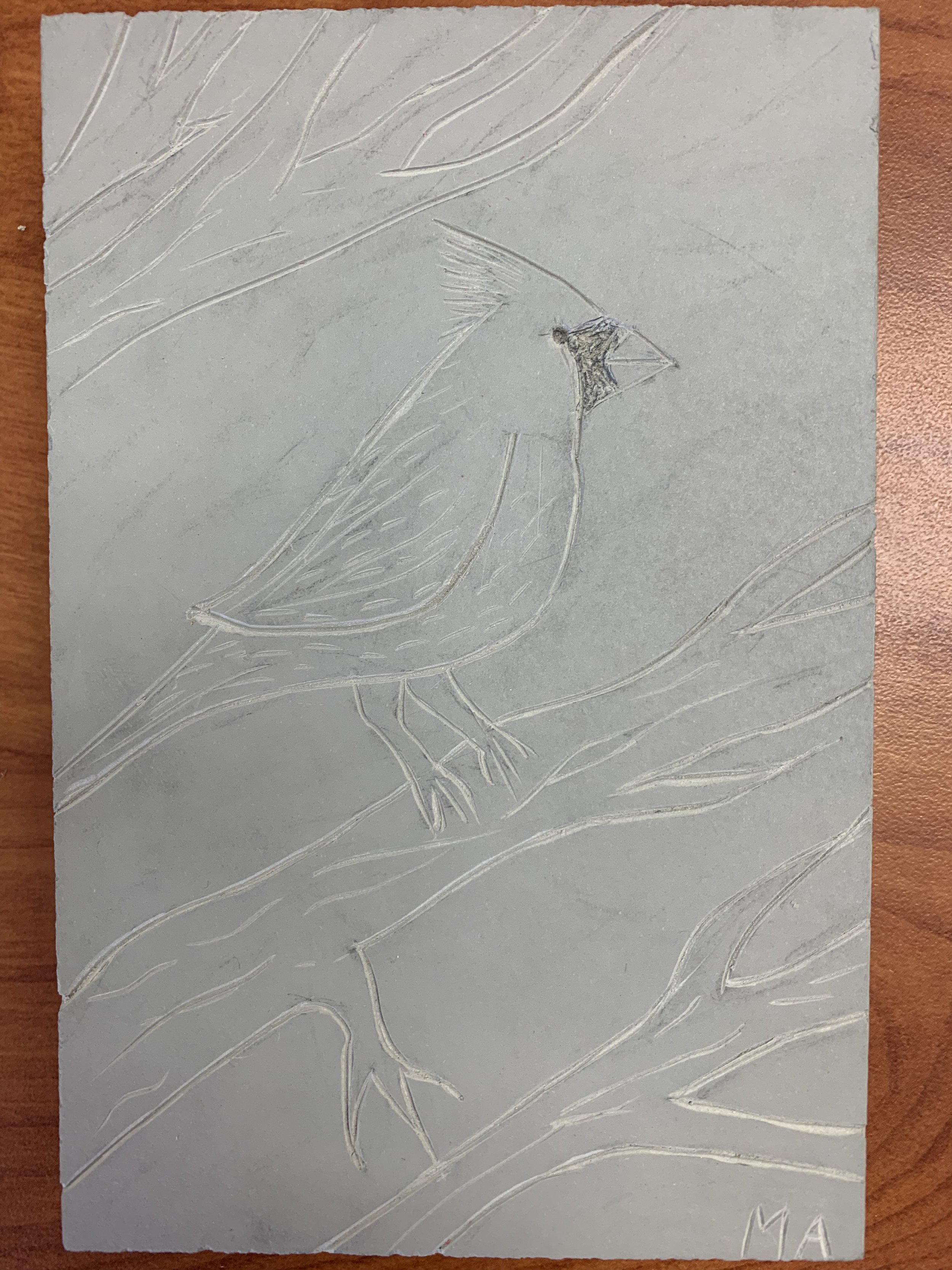
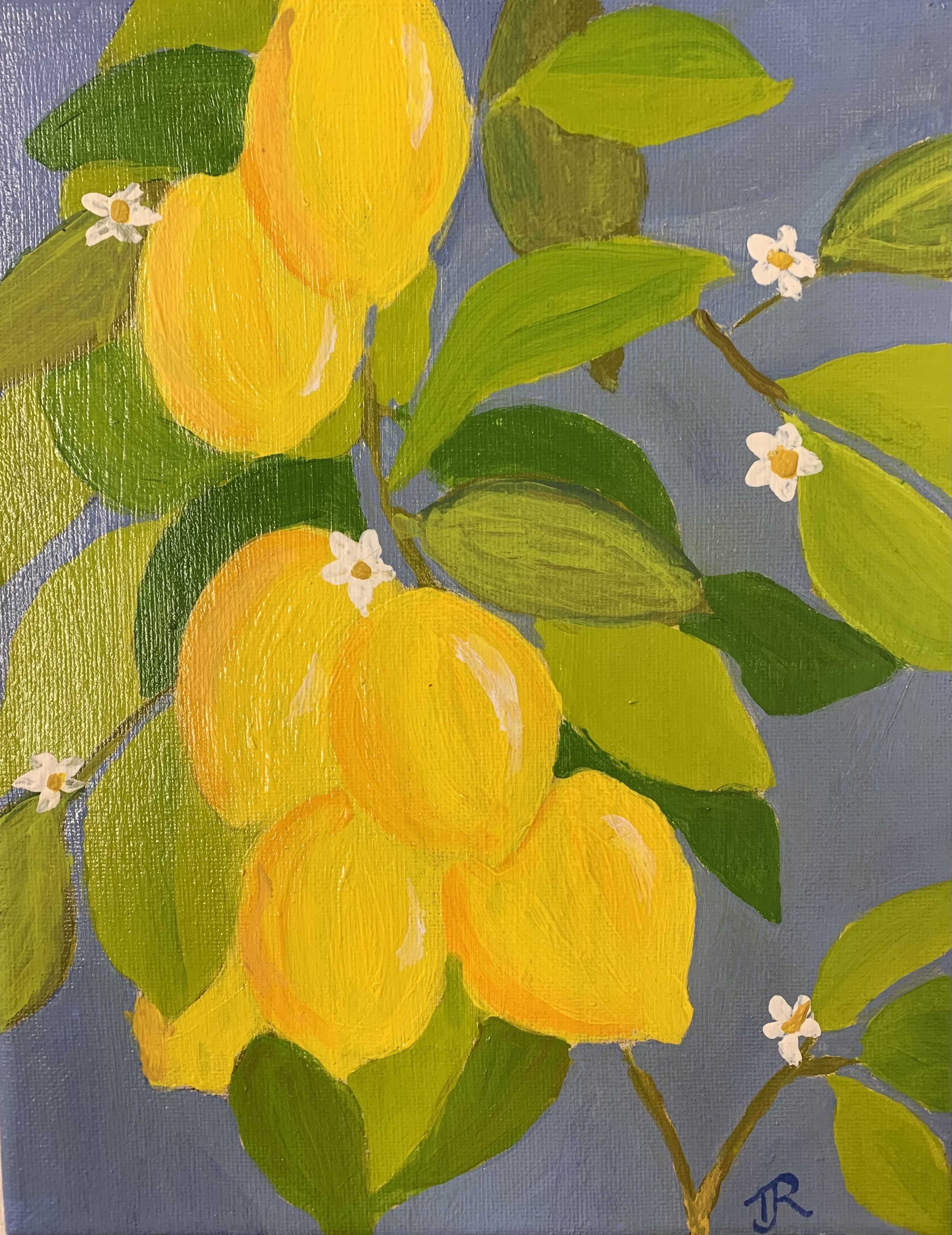
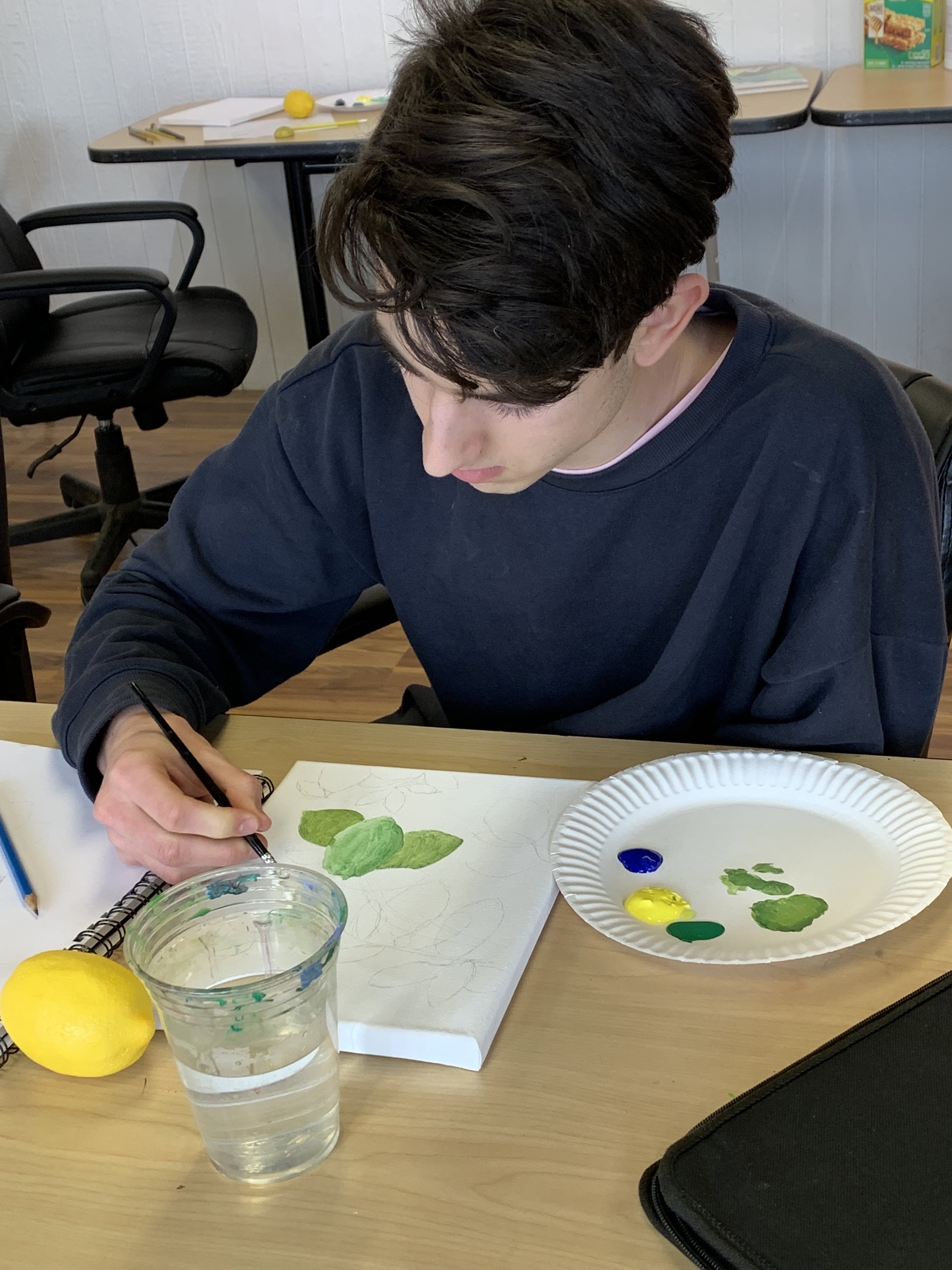
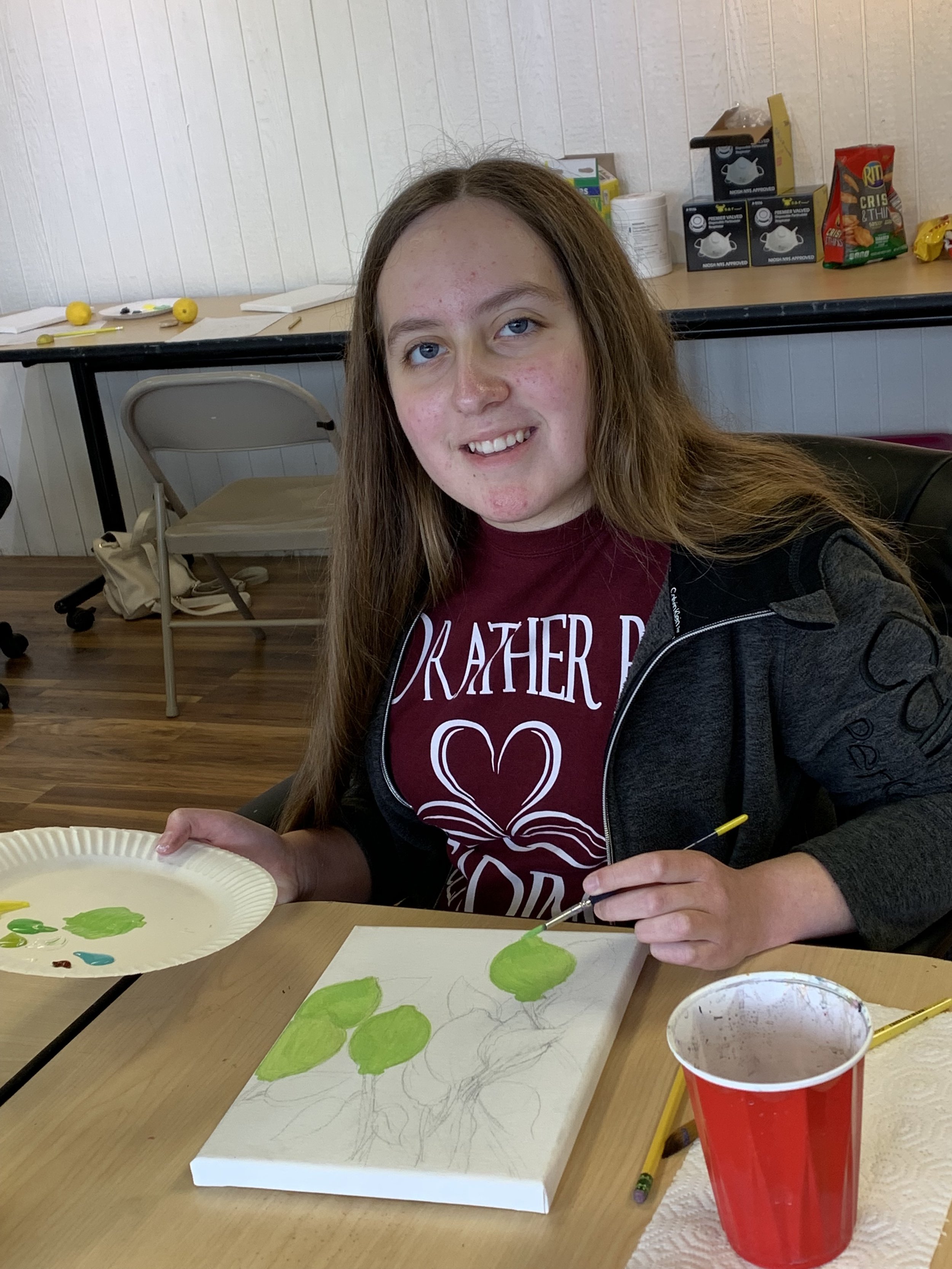
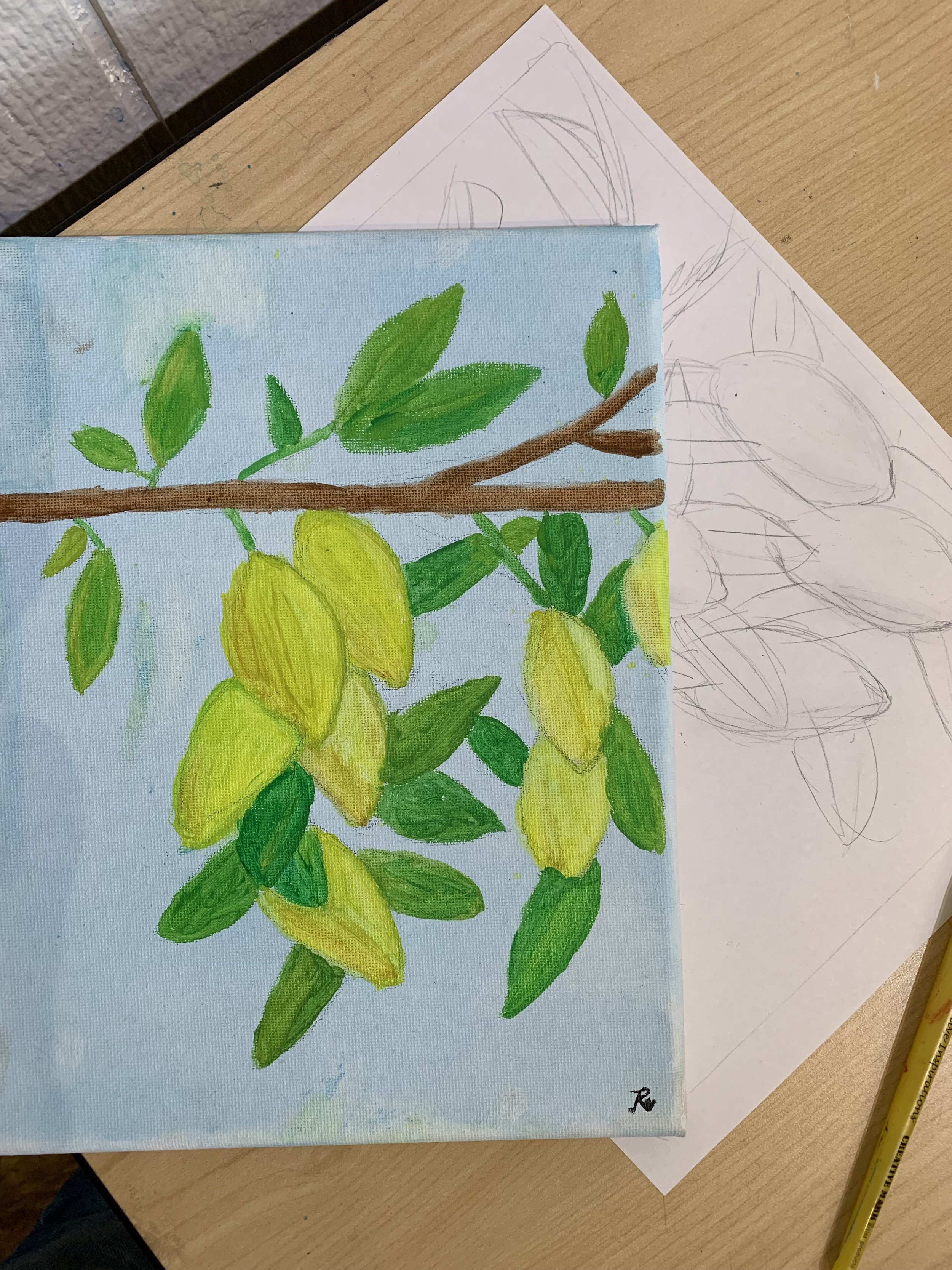
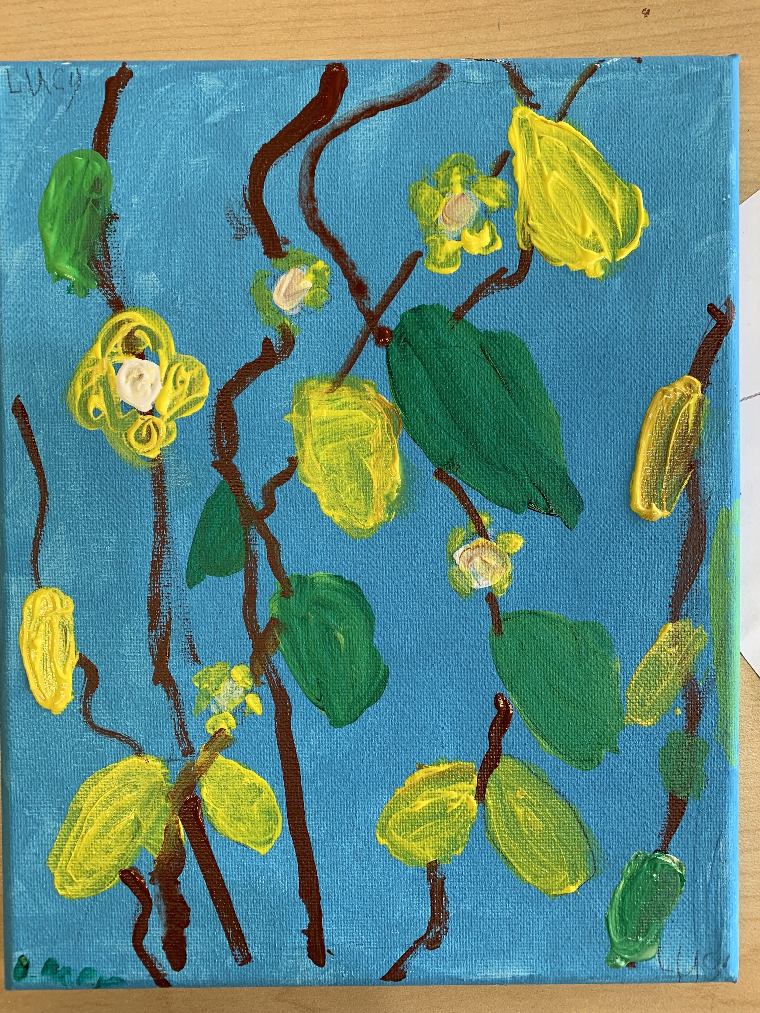
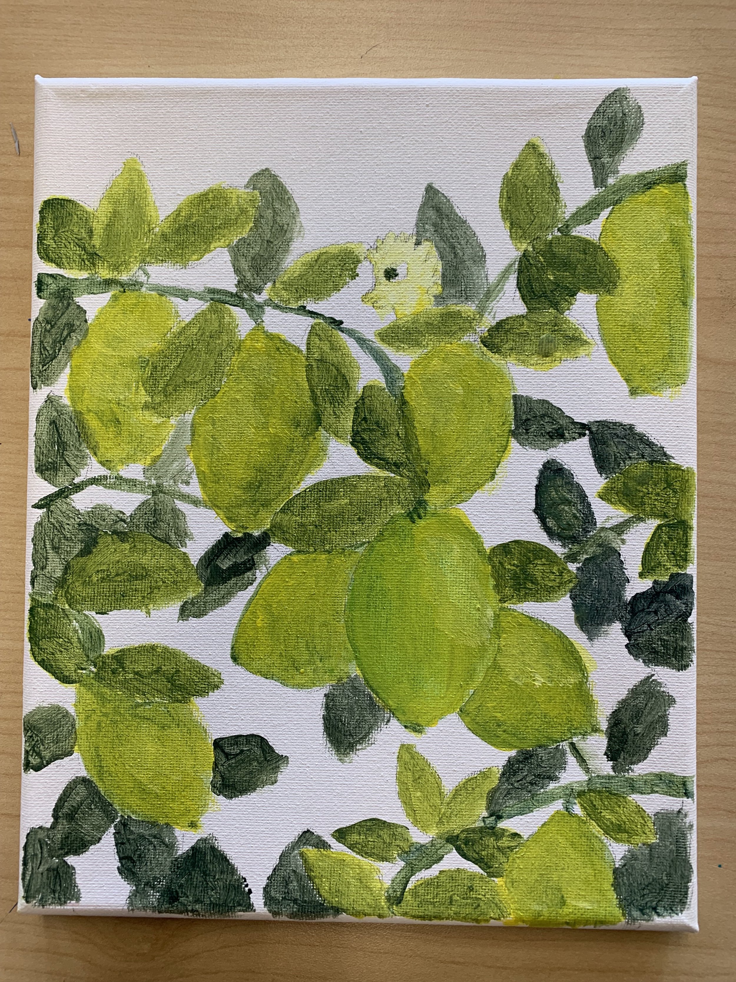
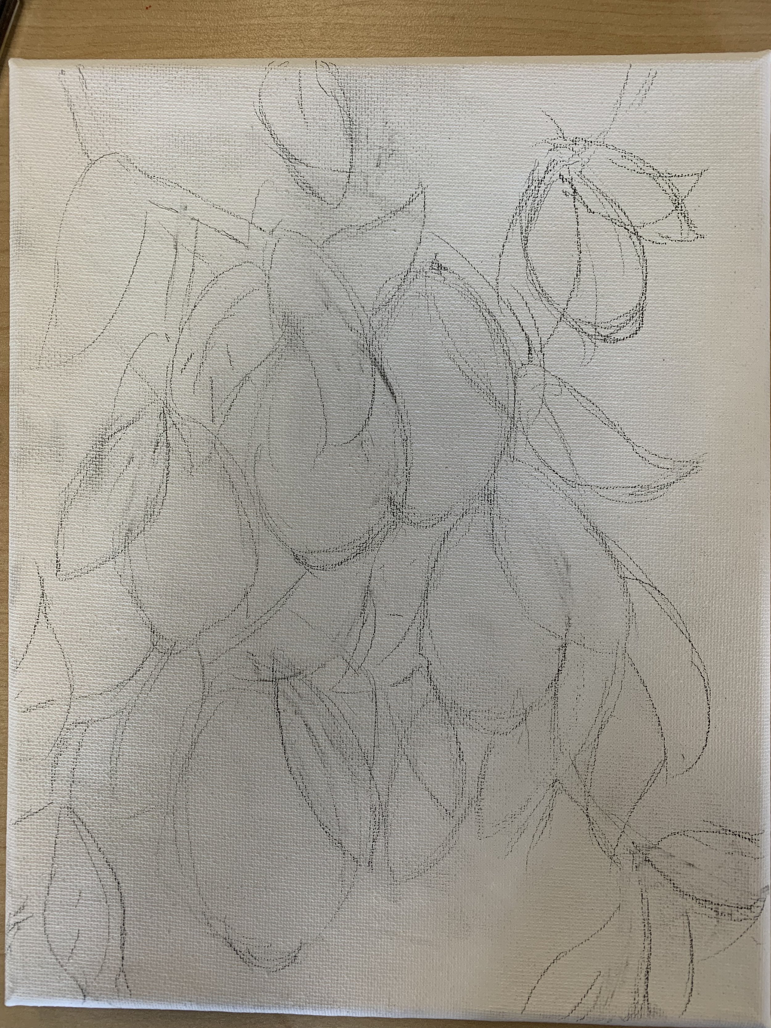
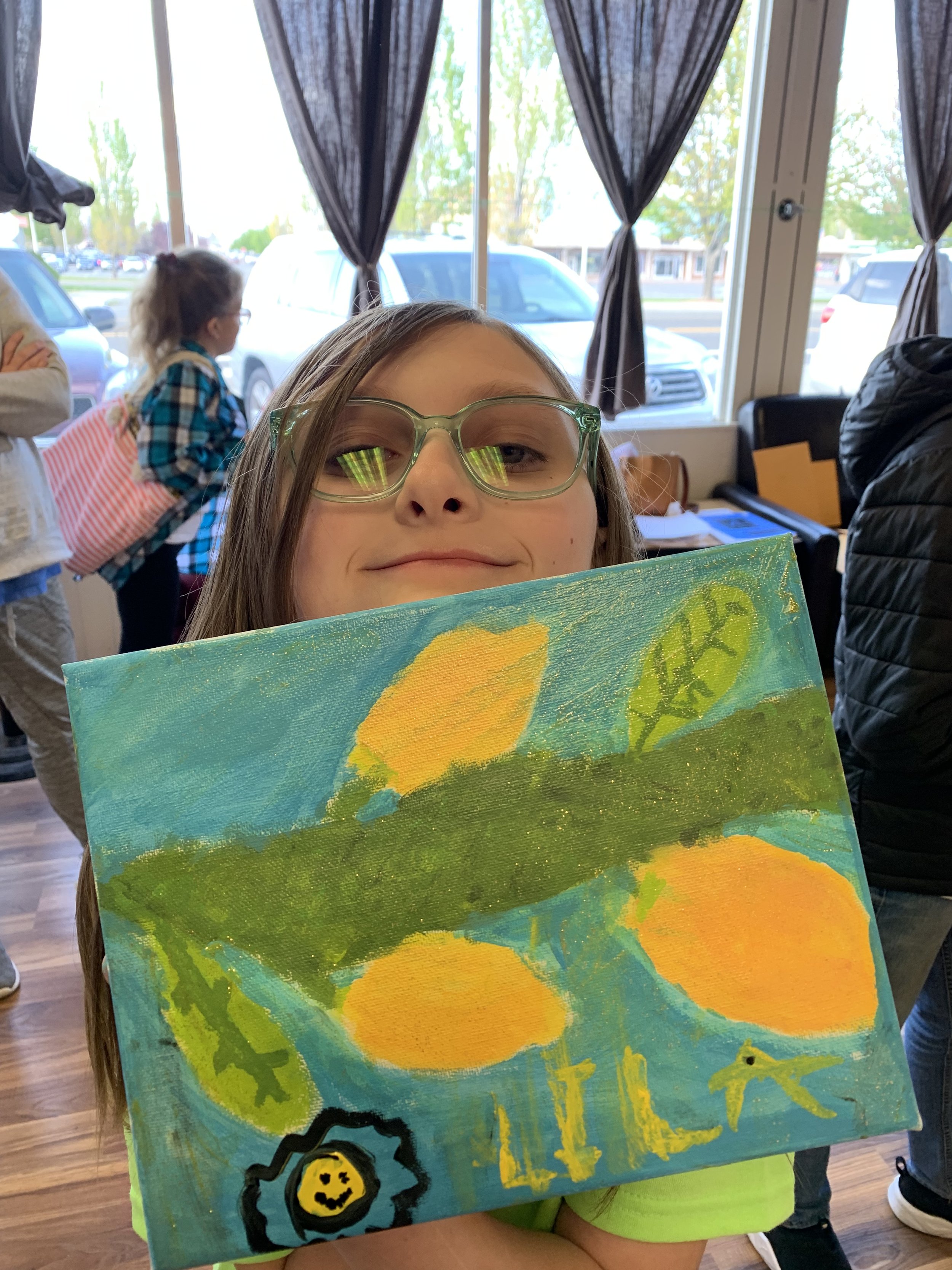
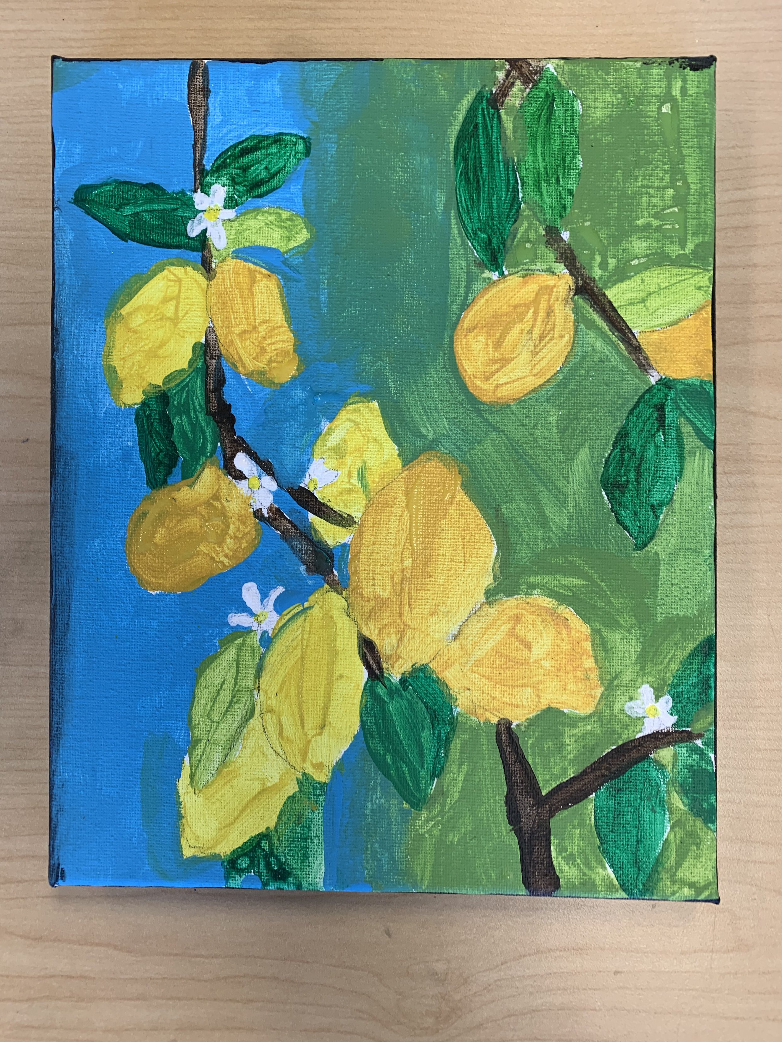
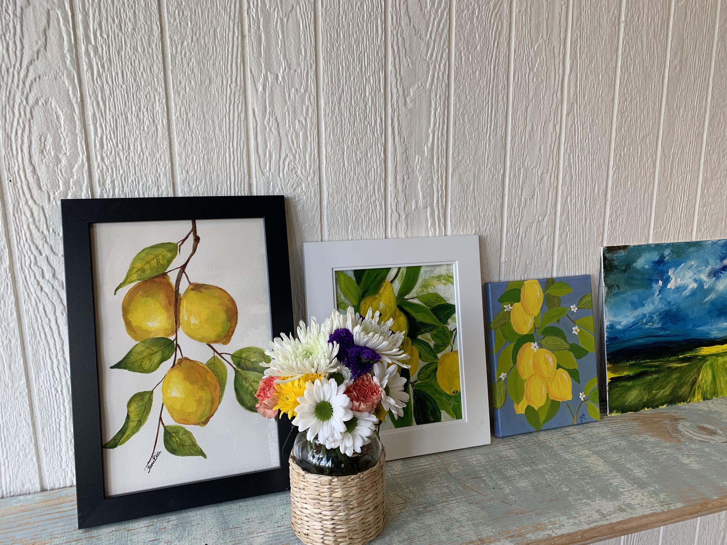
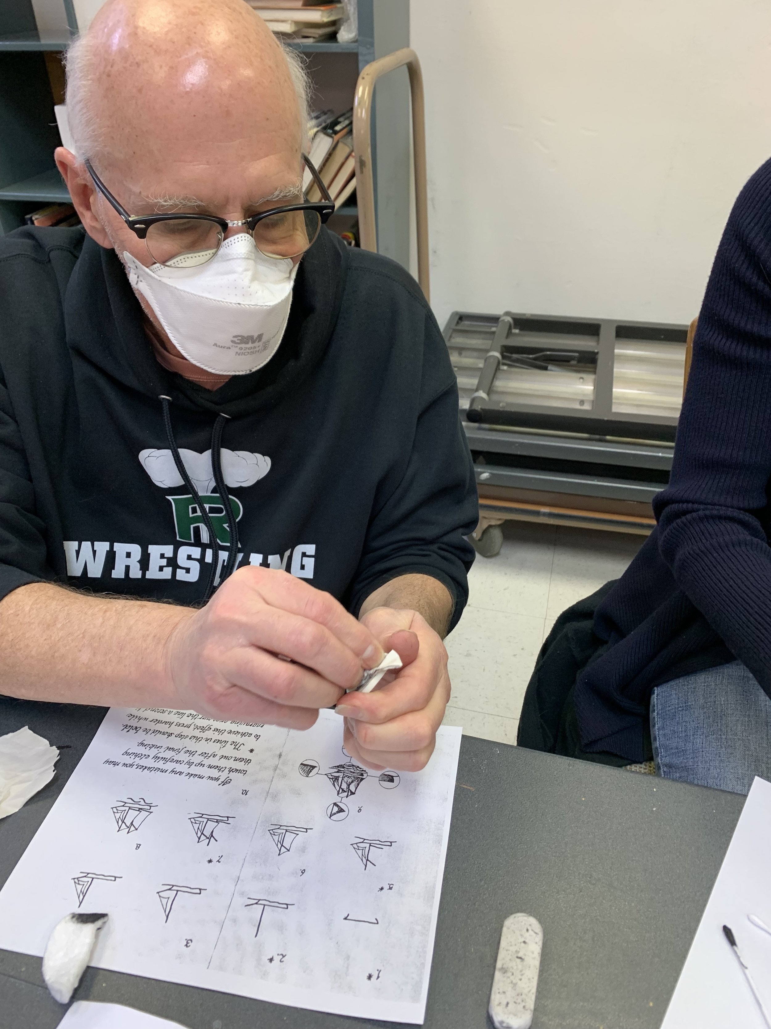
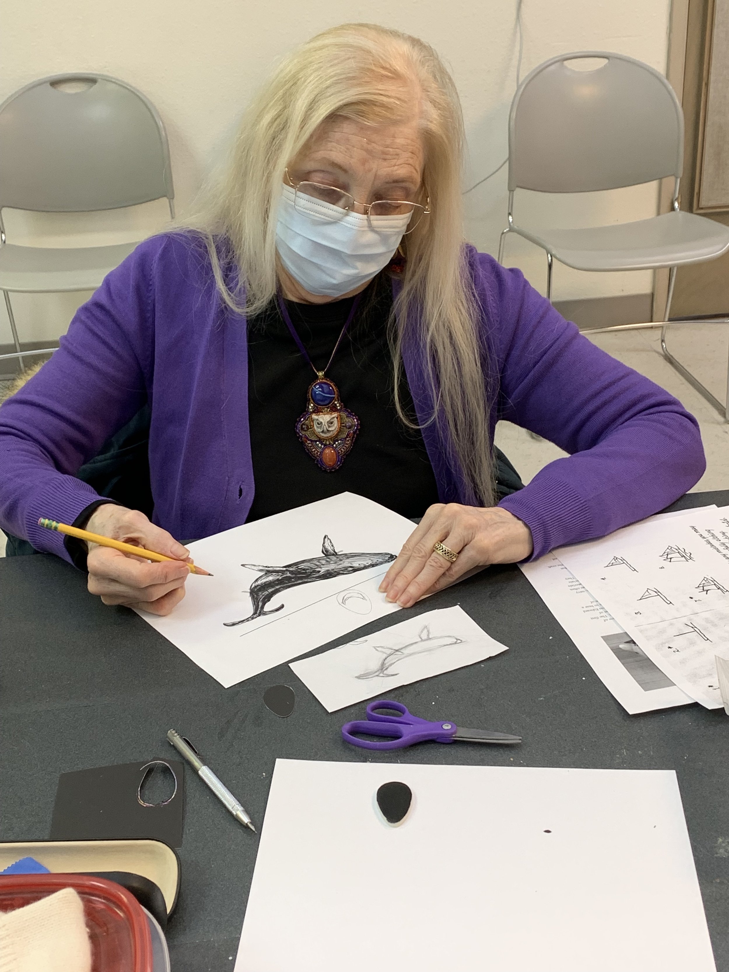
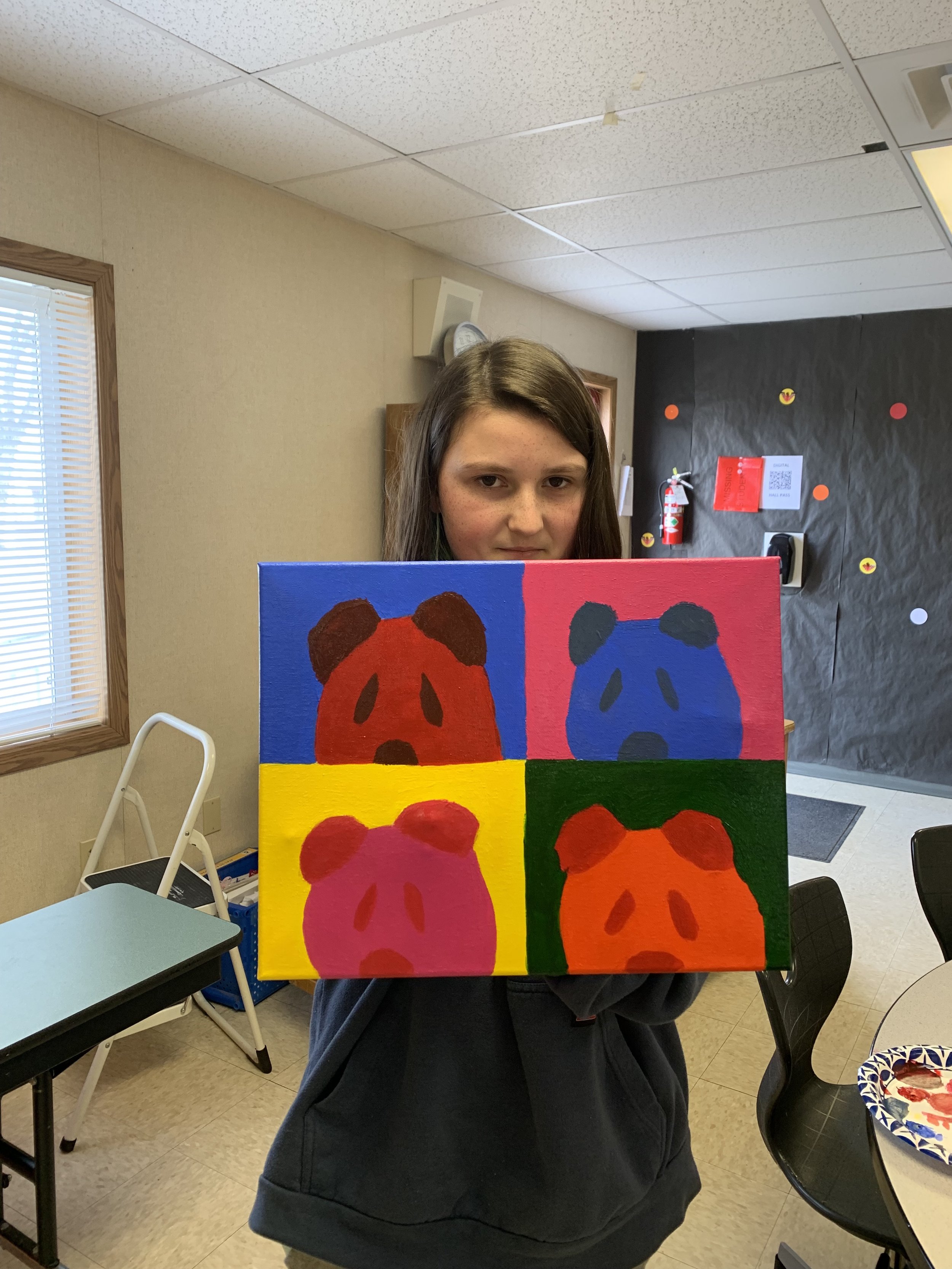
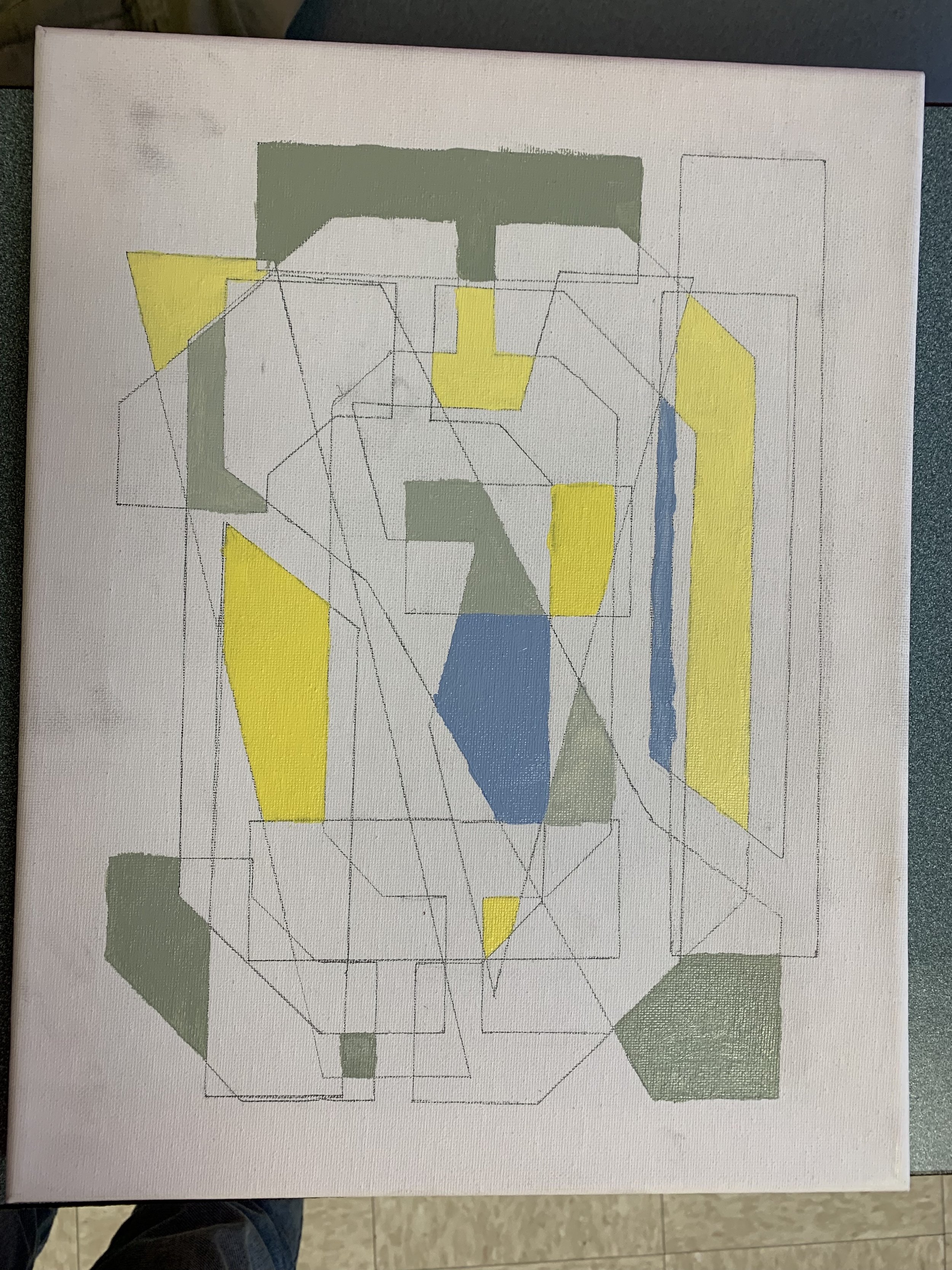
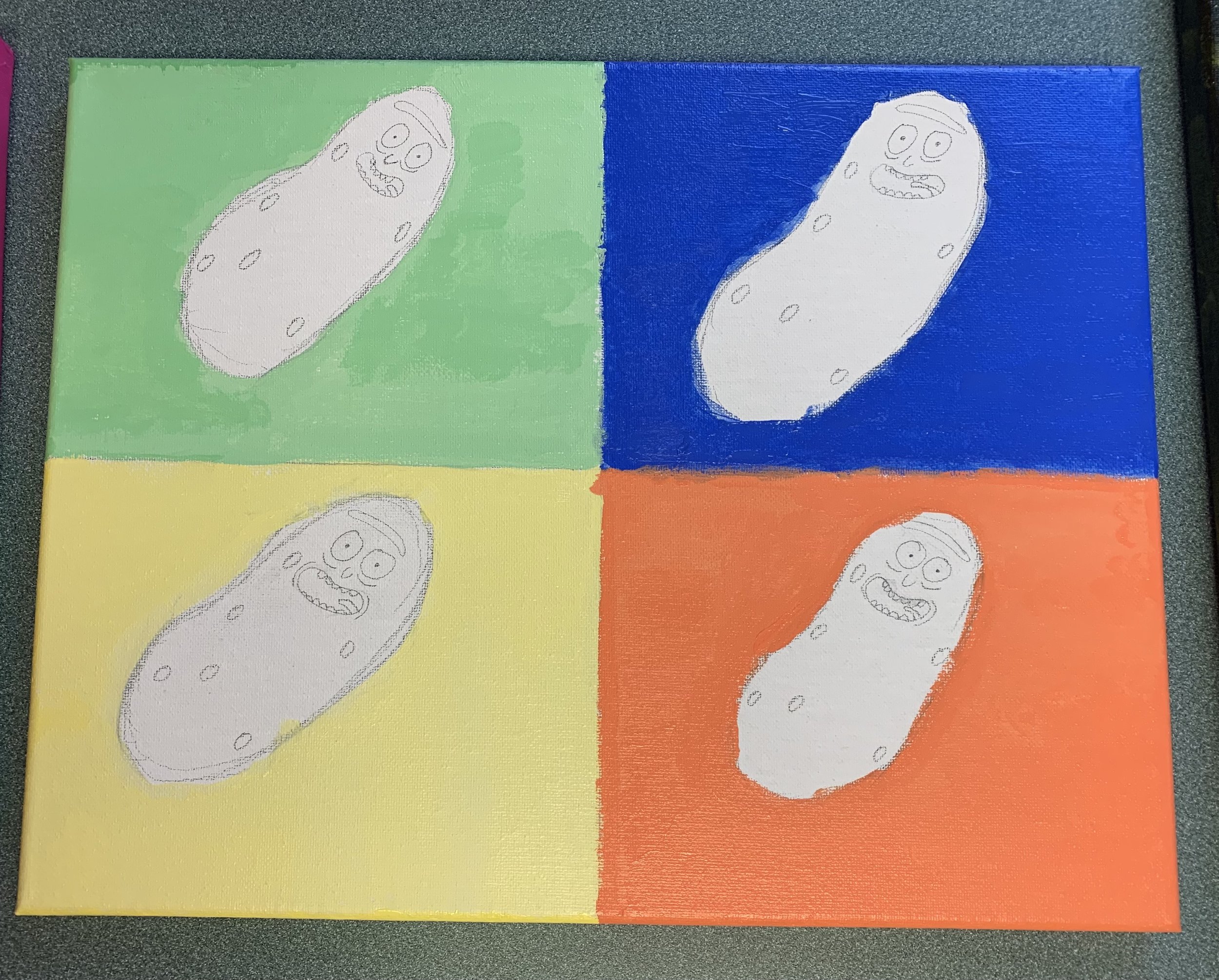
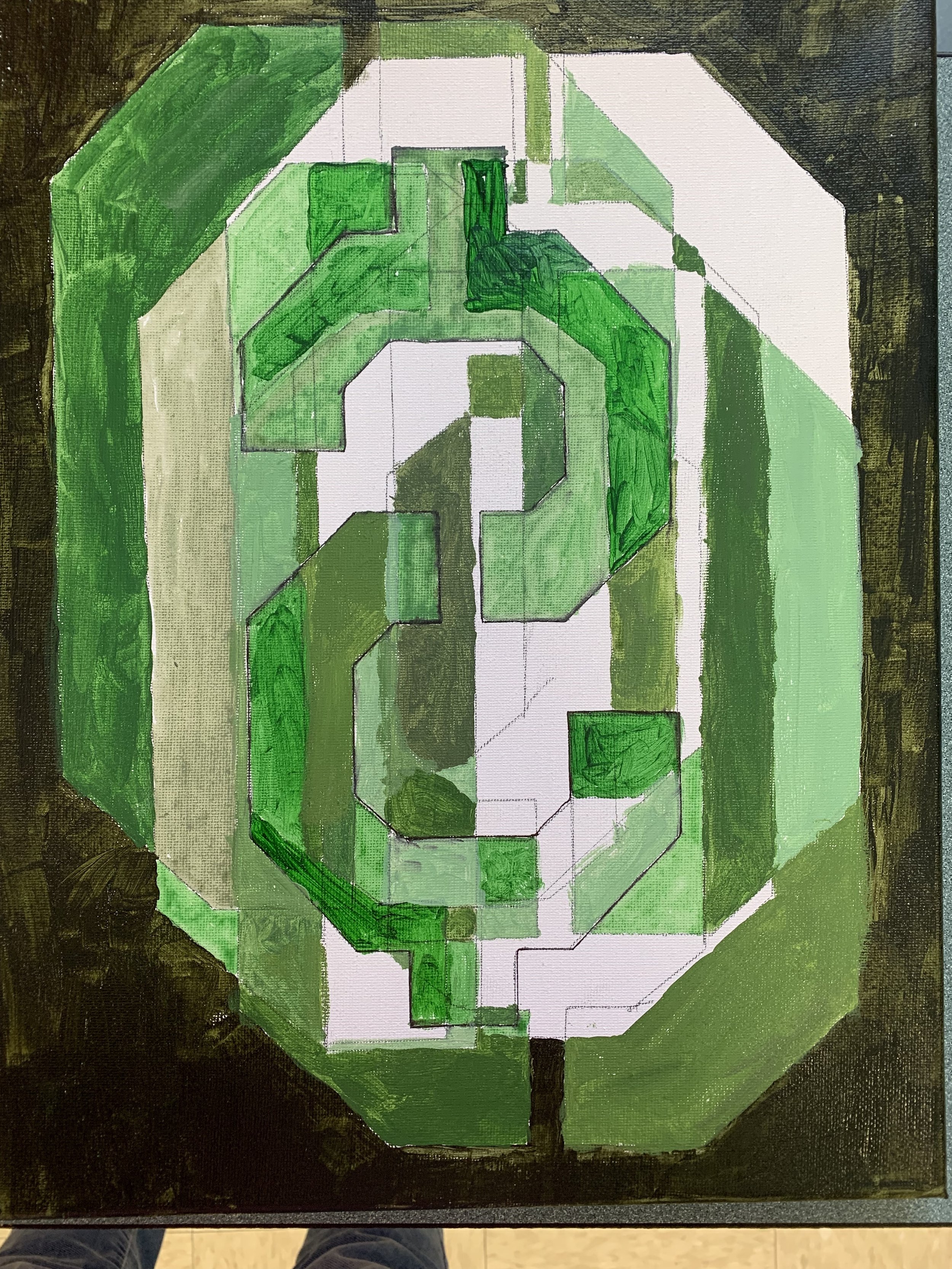
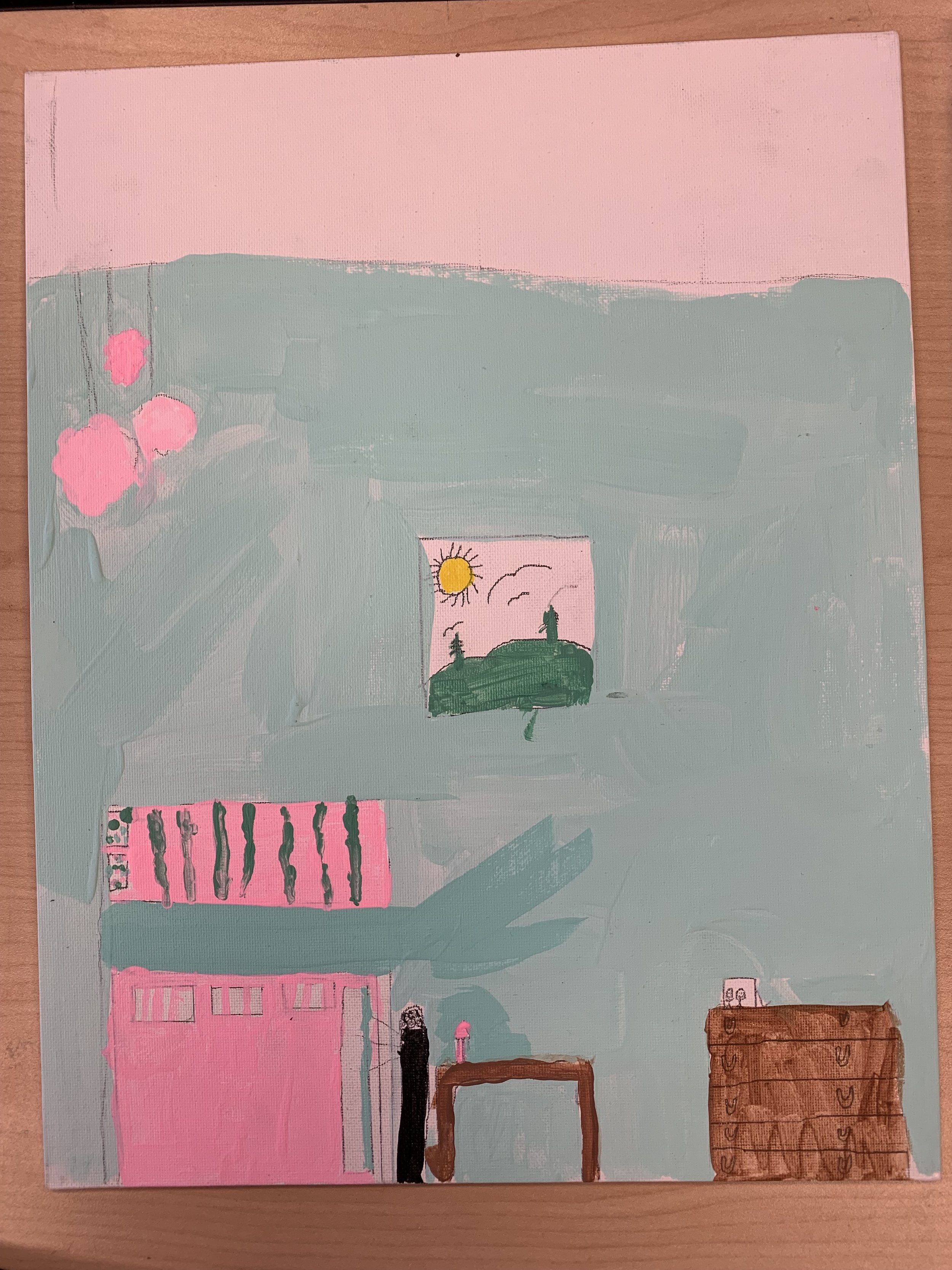
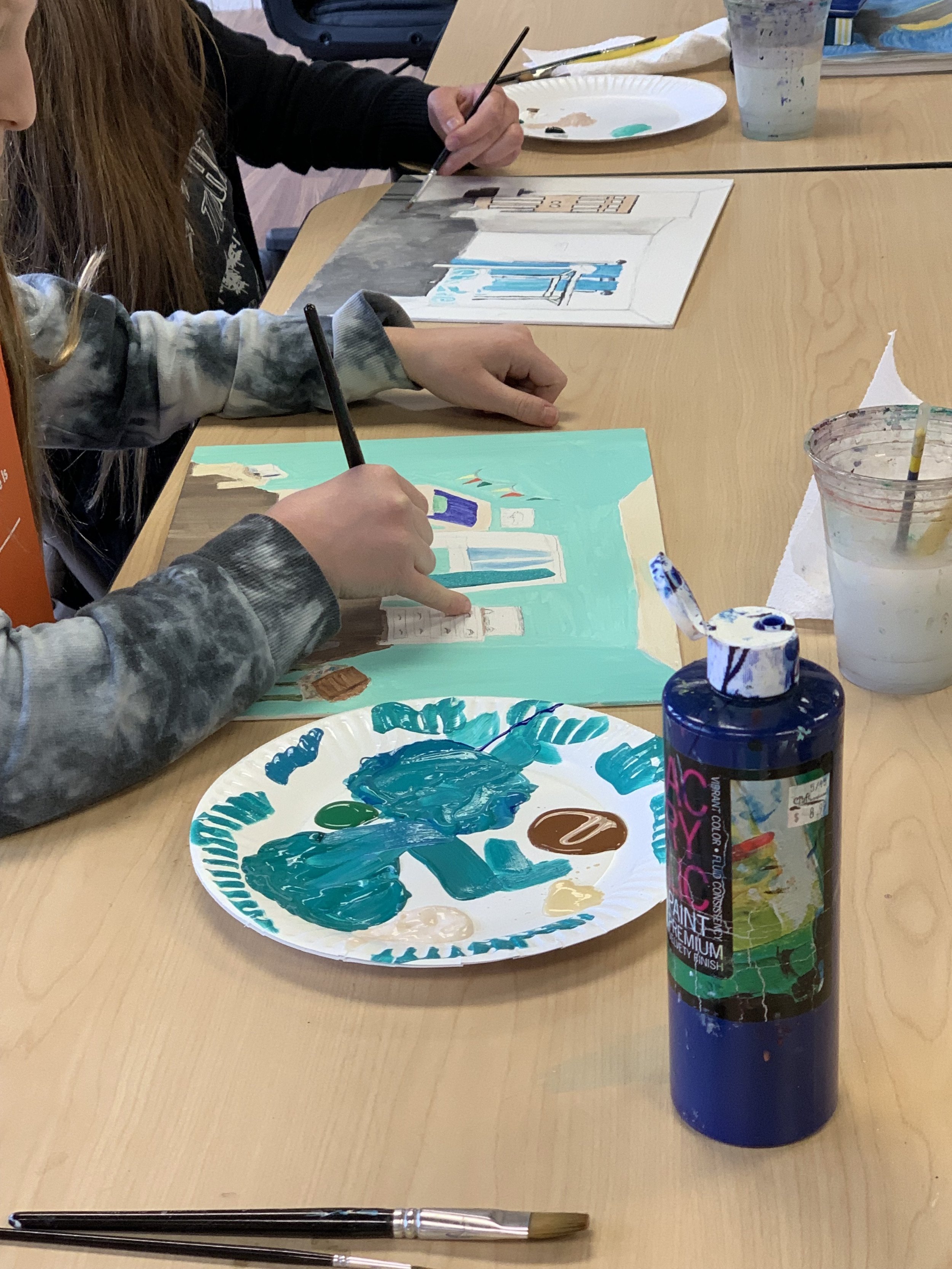
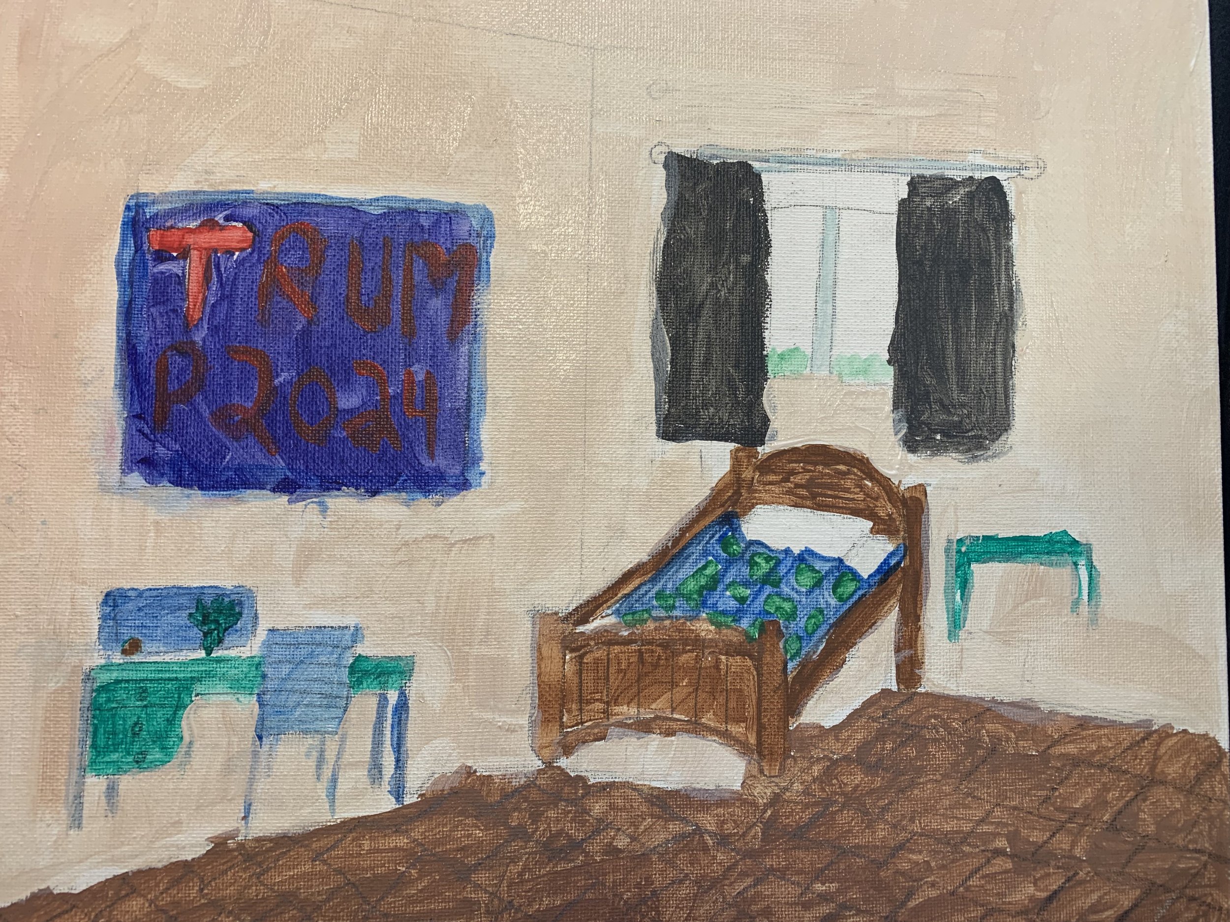
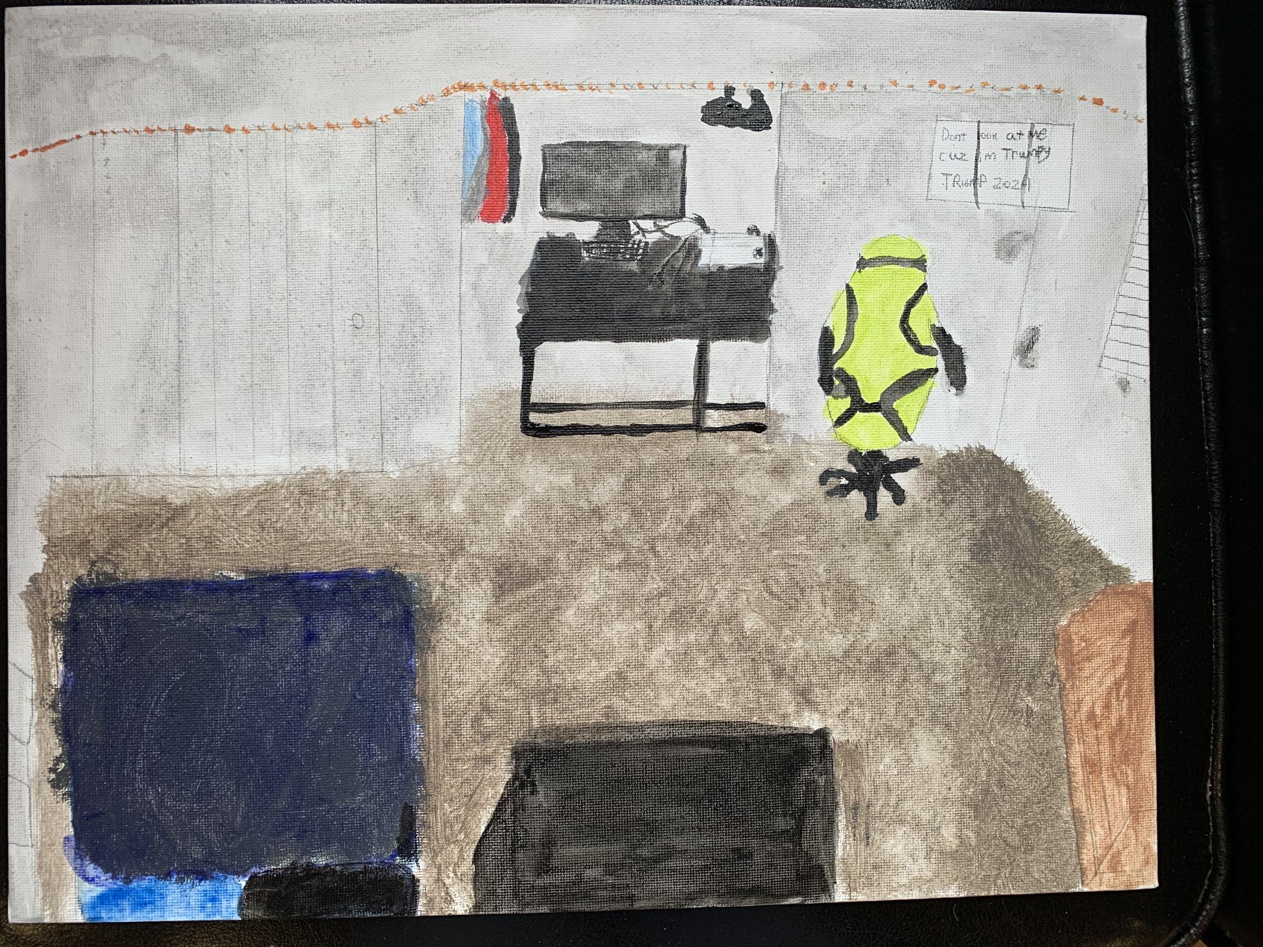
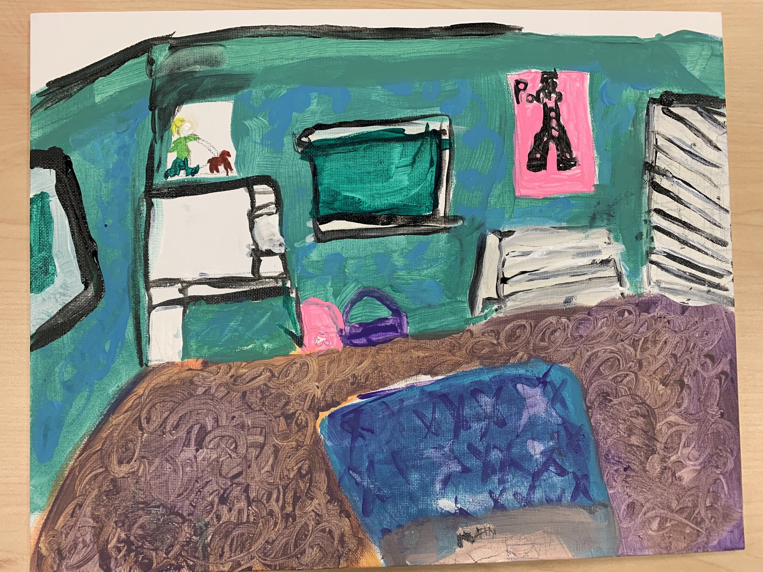
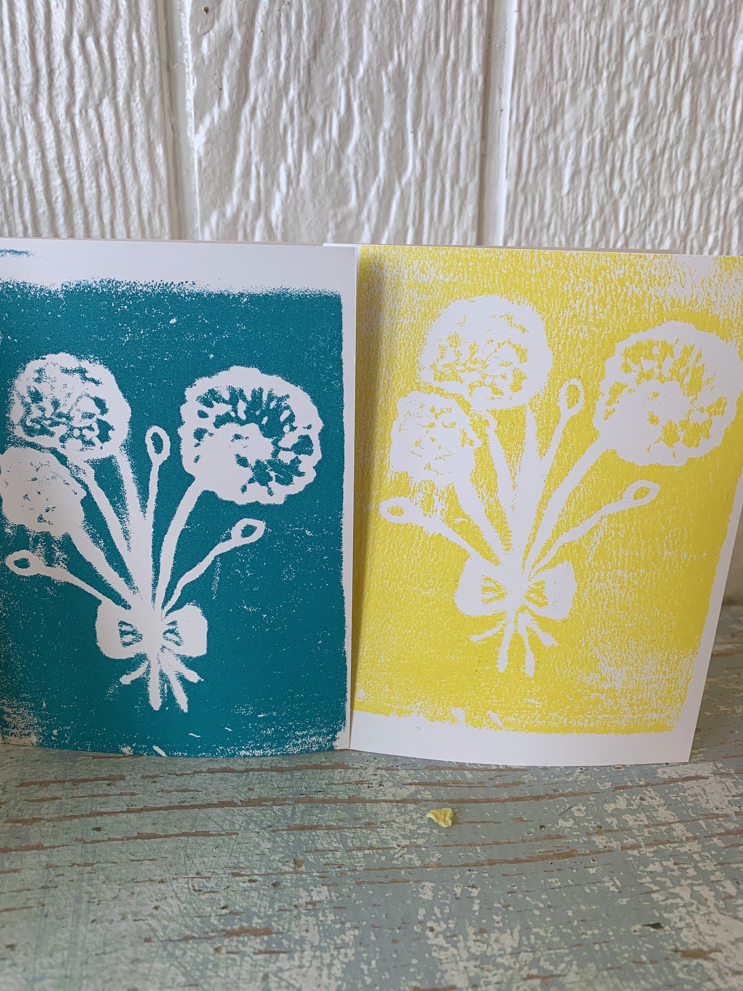
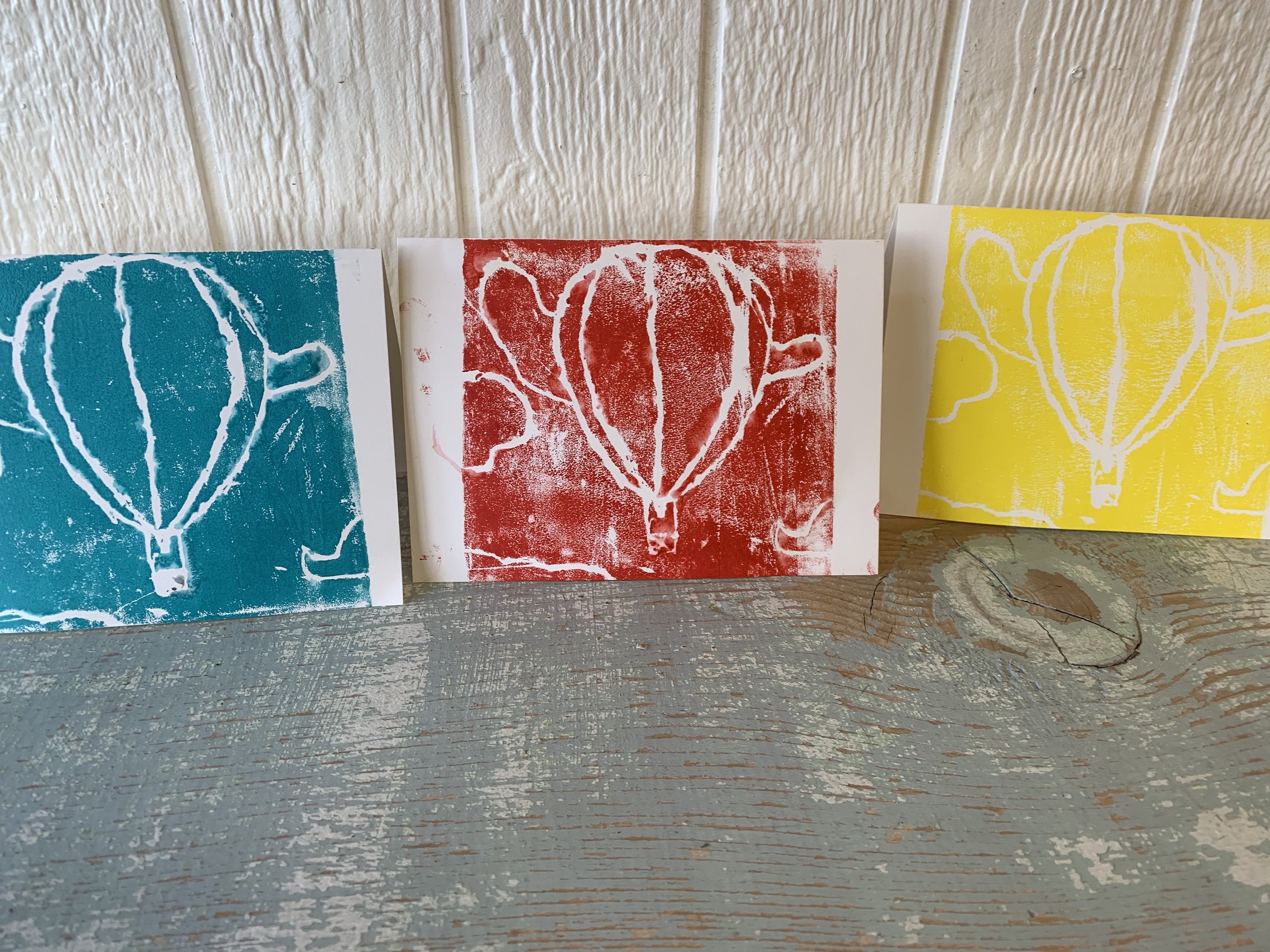
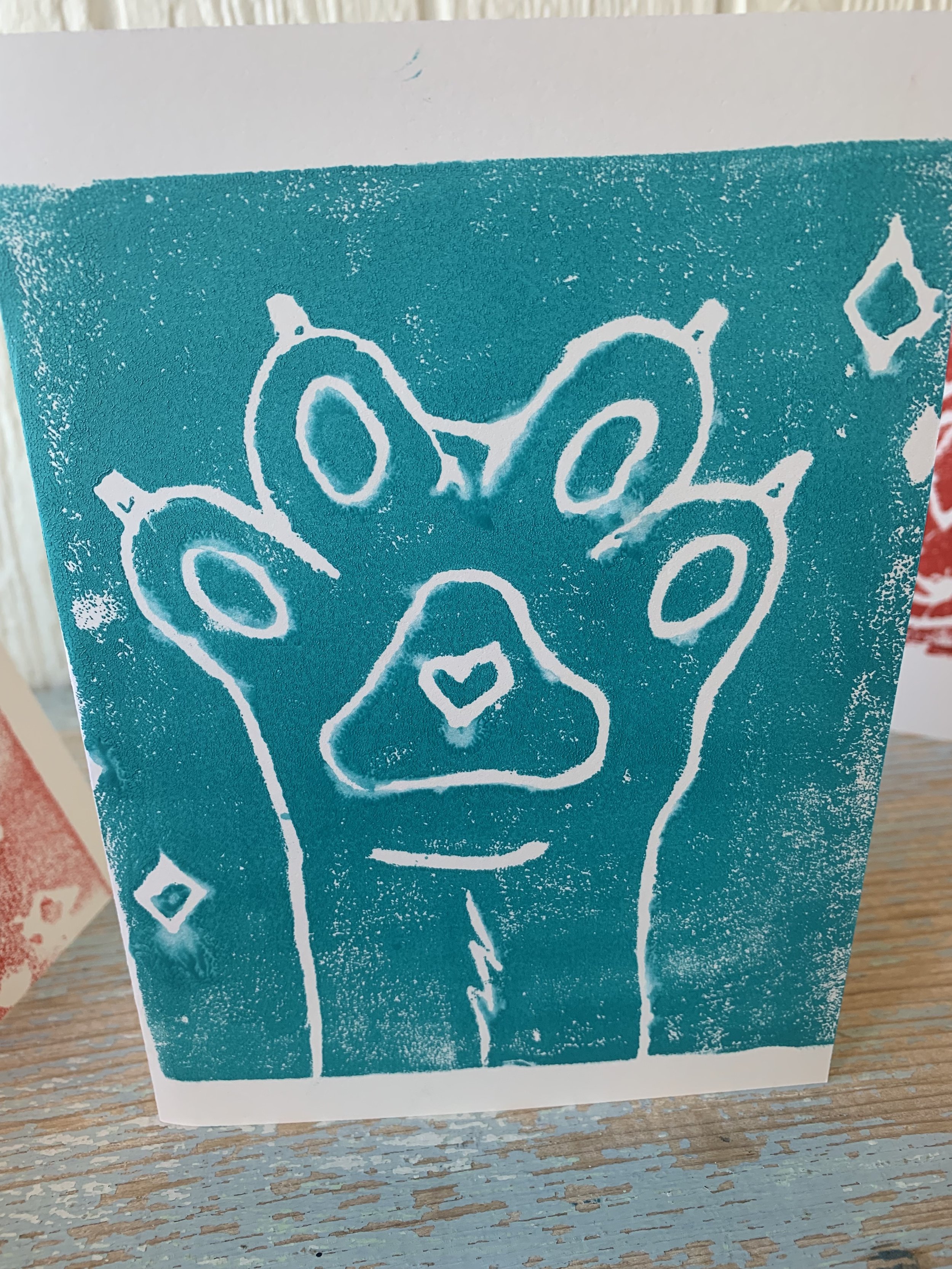
I introduced Jasper Johns and Andy Warhol to my students along with an exercise using the color wheel. The students decided whether to channel Johns or Warhol and then whether to use opposite colors or analogous colors for their pieces. I encouraged mixing their own shades of color instead of simply using the premixed color in the bottle. I love the way these are turning out!

Jasper Johns adhered to a strict set of motifs for a career that has spanned over 50 years, Johns combines texture, color, and line to create compositions that are inspired by known images, the most famous of which being flags, maps, and numbers.  

For Jasper Johns, the familiar objects and signs of everyday life are ideal subjects for art. It was a radical notion in the mid-1950s.
Andy Warhol’s works explore the relationship between artistic expression, advertising, and celebrity culture that flourished by the 1960s, and span a variety of media, including painting, silkscreening, photography, film, and sculpture. Some of his best known works include the silkscreen paintings Campbell's Soup Cans (1962) and Marilyn Diptych (1962).

Van Gogh's Bedroom

Tying a famous artist in with an art project, I had all the students sketch their bedroom and bring it to class. They transferred their sketch to canvas and painted with acrylic.

Simple Prints

Every year I think I’ll introduce linocut and every year I opt for the styrofoam, when I imagine hands securing the linoleum on the far side of the linocut blade that might inadvertently slip and skip over the linoleum straight to the curve between the thumb and forefinger…Okay, that might have happened to me in grade school. I should get over it. Next year, we’re doing the real deal.

Styrofoam works fairly well though curves and circles are a little difficult to maneuver. But overall I love the finished look. We use real printing ink- not acrylic paints- on glass plates to load the brayer.

You have to remember that words and letters need to be imprinted backwards so they come out forwards on the print. !YADHTRIB YPPAH looks kind of cryptic until you print it.

Tempered glass is a great surface for rolling out the ink.

Lined up to dry while they work on the next.

I love how the prior print color peeks through at the edges

This cat has so much personality!

This little artist just welcomed a baby sister into their family. The lion is her symbol for the fight she put up to get out of the hospital and go home to her family.

“HI”

“Hi,” to you too.

Older students can veer towards not being “cute” with their execution. (Pun intended.)

Always a dinosaur theme with this guy.